It’s hard to believe I wrote my first design trends article a year ago. 2022 saw many of those predictions come to light. With them, even more trends I don’t think any of us saw coming took root.
Generations aging into target market demographics and a blast of nostalgia have brought back many good (and bad) design trends. Social and consumer awareness have rocketed trends that I’m ecstatic to see. So before the year gets away from me, let’s look into the future again to predict the 10 presentation and web design trends we’ll see in 2023.
Top Trends In Presentation Design And Web Design For 2023
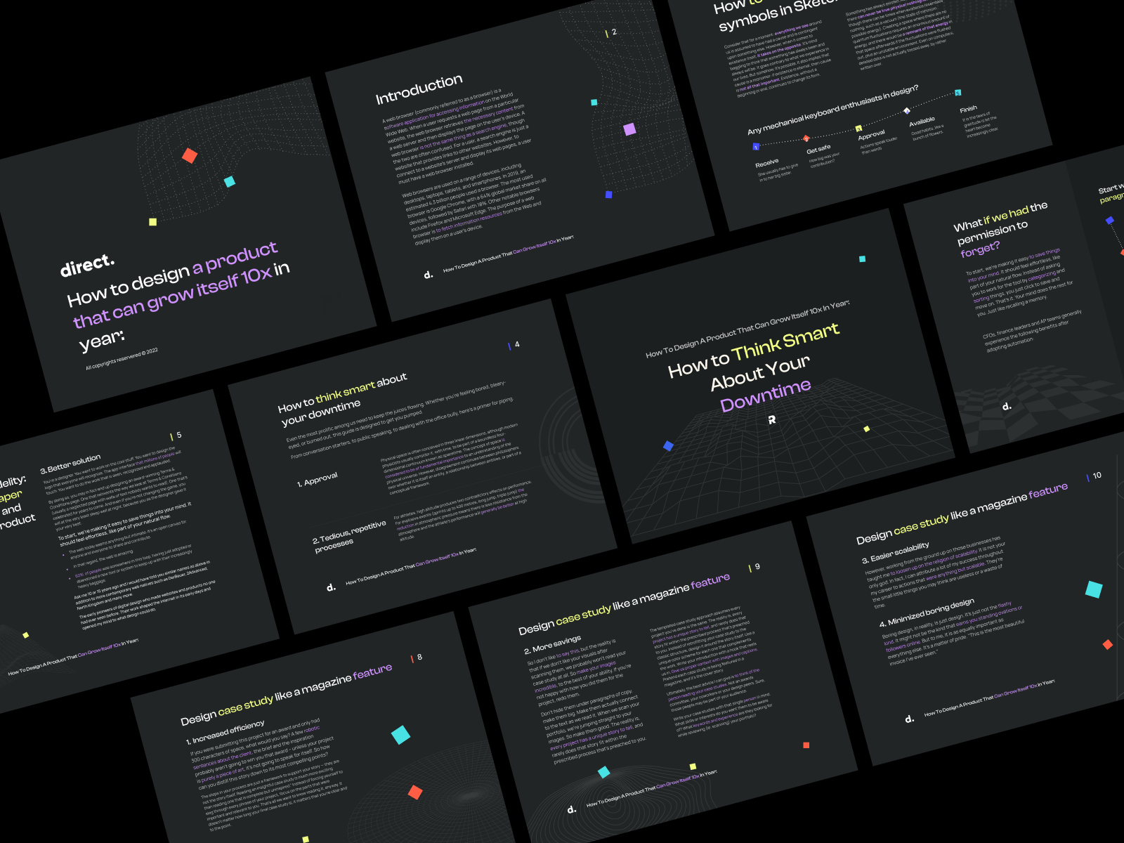
01. Dark Mode
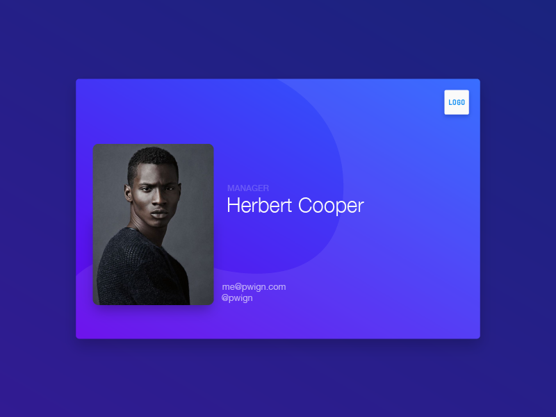
Dark mode is a design trend that crept into our lives through mobile apps like Twitter and YouTube. Today, most mobile and desktop apps can toggle between light and dark modes. The concept of light-on-dark emphasizes text and graphics. It can also be less strenuous on the eyes for people who use screens for several hours a day. (Let’s be honest, that’s most of us. Myself included!) As an added bonus, dark mode almost entirely removes the need to worry about accessibility in design. 2023 will see a huge trend toward websites and presentations either opting into a dark-mode version or completely converting to a dark-mode design.
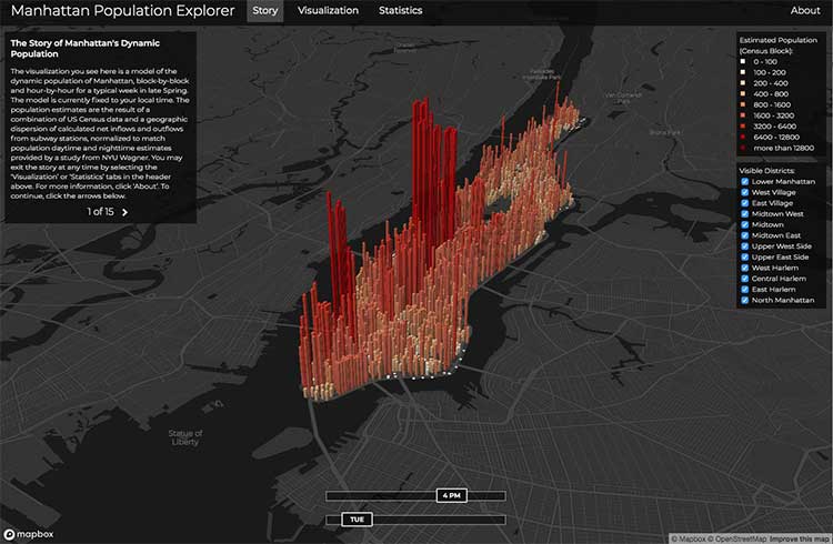
02. Interactive Data Visualization
People are visual creatures. Whether you have 10 minutes to pitch to a room of investors or 10 minutes to present this year’s profit breakdown to the board. You want to do so in a way that helps interested parties understand the most important data points quickly. Interactive data visualization marries digestible text with engaging visuals to provide effective data presentation. Companies like Tableau have already started to adopt it to help internal teams present data. 2023 will see more companies adopting interactive data visualizations into their websites to increase retention rates.
03. Retro Graphics (90s and 00s)
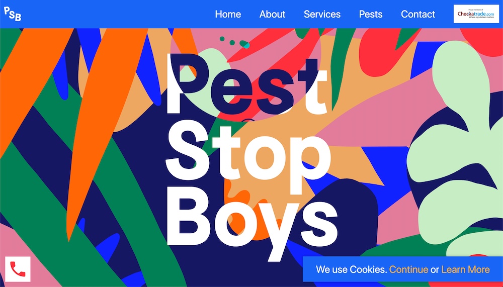
Fashion styles from the 90s and 00s aren’t the only things making a comeback. As millennials, and Gen Z age into the targeted consumer for most brands, we will see a boom of 90s and 00s nostalgia in graphic design. Bold color blocks, pixelated art, and primitive internet elements will re-amerge. Companies will incorporate these elements best in ads, social media, and in sparse pops on their websites. I don’t see tie-dye coming back to design yet, but we still have 365 more days to go.
04. Bold, High Contrast Colors
Bold, high-contrast colors will be a trend even for brands that do not embrace the 90s nostalgia. As presentation and website design continues to trend to dark most, brands will need to incorporate bold color accents to their palette. Using bold colors to draw users’ attention to elements we want to stand out. This is not a new tactic, but we will see it continue to grow.
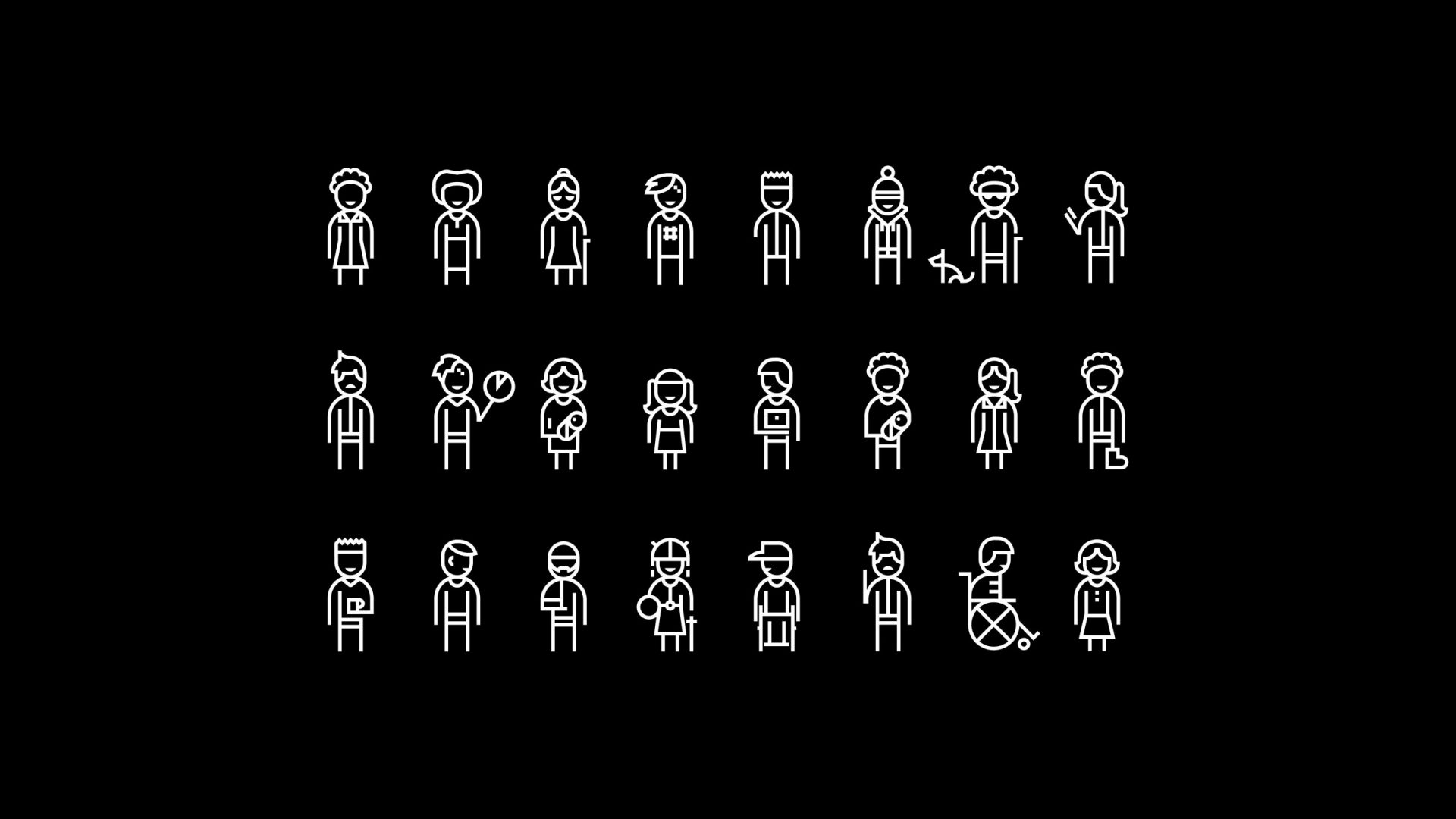
05. Inclusive Visuals
More brands will adopt inclusive visuals as consumers [rightfully] demand representation. Brands need to adopt inclusive, ethnically-diverse visuals into every aspect of their design. From presentation design to marketing and web design. Custom graphics and photography will be needed as stock photography and graphics catch up. Brands should expect to increase their marketing budgets in 2023 to accomplish this. The most notable brands will include indigenous, East Asian, and disability-friendly imagery.
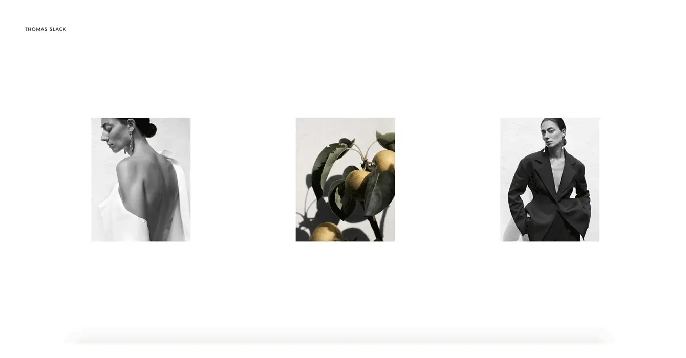
06. Minimalism
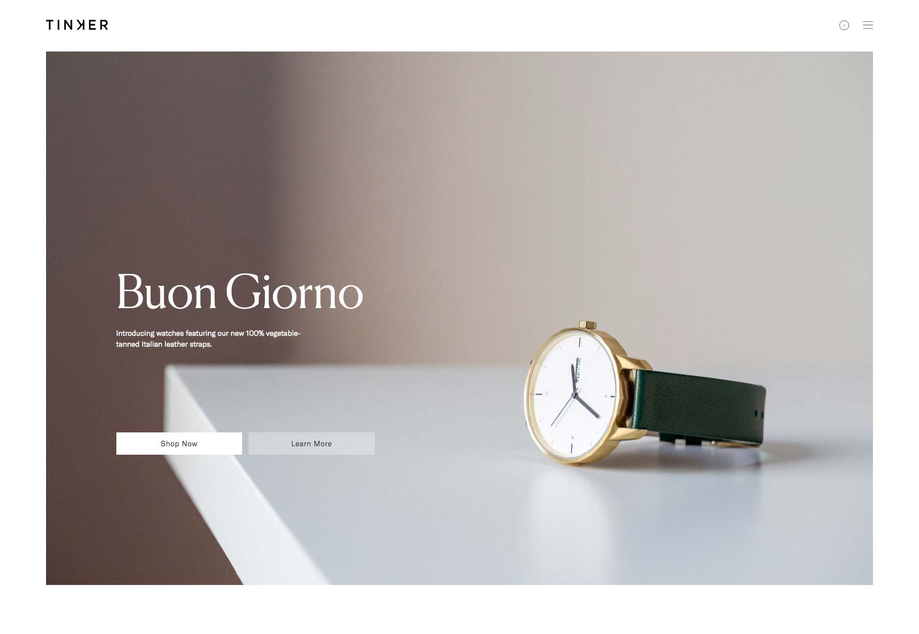
Minimalism has been a trend in presentation and web design for the past three or four years. 2023 will continue to see this trend, despite marketing and advertising teams gearing up for maximalism and anti-design trends. Consumers want to get information quickly. Reducing design distractions and moving to a more grid-based design style, like Japandi, will allow you to guide consumers or investors to critical data and selling points more easily. We are already seeing this in the increase of Japandi style web design and interior design.
07. Hand-Drawn Illustrations
When we want flashy animation, we stream the latest DC or Marvel movie or grab for our VR headset. Outside the fantasy world of the theater and VR, consumers want authentic designs. Hand-drawn illustrations (that are inclusive) make brands stand out. This artistic style brings character and a sense of relatability to brands. 2023 will see an increase in hand-drawn illustrations in fields like healthcare, technology, the food industry, and the financial sector. Brands like Starbucks, Monarch, Brutask, and Mailchimp are racing to embrace this trend.
08. Creative Typography
Brands have always played with typography. For the last several years, the minimalism movement has shifted website and presentation typography to be a mixture of serif and sans-serif fonts. It’s clean and easy to read. (Personally, I’m still a big fan of this combination.) As trends shift back to bold, creative styles we will see typography shift as well. Mixing creative typography with serif fonts will be more common on websites and in presentation design. The key is to use creative typography in small doses. Use bold fonts in presentation titles and to emphasize data. Use the more classic serif fonts for body text.
09. Fewer Words, More Impact
Web design and presentation design have always been similar on this front. People don’t want to read big blocks of text, they want to get to the point. Your presentation designer should already be using fewer words to drive more impact. However, this year we will see web design shift to this as well, with Google and other search engines emphasizing the importance of quality content, not quantity. This shift to “fewer words, more impact” will allow web designers to get more creative on using graphics and illustrations to drive users’ eyes down the page. Learn more about how to use “less is more” in presentation design in my blog from last month.
10. Smooth Shadows
Just like the late 2010s were all about flat design, spearheaded and inspired by Apple, textures and shadows are coming back. The goal is to use subtle enhancements to help users navigate designs. This trend will be used more and more in web design to show users what is ‘clickable’, what is ‘clicked’, and what might be ‘disabled’. In presentation design, smooth shadows are used to bring dimension to design and draw attention to critical visuals or data.
Where do design trends fit into your brand?
Determining how to stay relevant without compromising brand identity is a hard balancing act for design teams. My rule is to never compromise brand identity. Trends are fun to play with on social media and in advertisements, but you should always be able to look at a piece of work and recognize it as your own brand.
If you’re ready to embrace any of these trends in your presentation design or web design, I’d be happy to help. Together, we can determine what elements help drive your goal and create specific brand guidelines to help marketing and web teams understand how to use trends without brand confusion. Let’s chat.
Borja Zamora
A Barcelona native but San Francisco based, Borja explores digital marketing and design through articles, images, and quotes.
Related Posts
September 18, 2024
Crafting Compelling Strategic Narratives: A Deeper Dive
Strategic narratives, the compelling tales that businesses weave to convey…
September 17, 2024
What’s a Strategic Narrative and Why Do I Need One?
Discover the power of storytelling in business! Learn how to create a strategic…
September 10, 2024
Unlock the Power of Storytelling: Your Guide to Strategic Narratives
Ever wondered how to make your presentations super awesome? Learn about…
August 30, 2024
Captivate Your Audience: Presentation Design for Real Estate Success
Just like a beautifully decorated house makes a great first impression, a…
