Why ‘Less Is More’ Creates More Effective Presentations. Three elements determine if a presentation will be ‘good’ or effective – the presenter, how the audience connects to the message, and the supporting visuals. This is true for all presentations.
Think back to some of the best corporate presenters and keynotes of our time. You probably think of people like Steve Jobs or Sundar Pichai. They’re engaging and command the room each time they present. They’ve also mastered these three elements.
You can too.
While I can’t help you improve your presenting skills, I can help you understand how to harness the principle of ‘less is more’ to get your message across and create more memorable presentations.
7 Tips To Create More Impactful Slides
01. Start (and End) with your message
For this first tip, it’s important to push everything you think is right about presentation slide design aside. I know you’ve been taught to first have a title slide then an About slide at the start of your presentations. I would like to challenge that.
Having a title slide at the beginning of your slide deck is ok, because it’s not really part of your presentation. It’s the equivalent of holding music or a loading screen. Your title slide is just there to show on the screen until you’re ready to present.
Your presentation’s first real slide should start with your message. Not your About slide or Agenda, which is what many of us are taught in grade school. Why? People only remember the first and last thing you say. It’s important to hook your audience from the very beginning.
Would you rather they remember the story of how you started your company or how your product/service can benefit them? Probably the latter. This means you must get to what will wow them the most – your message – immediately. You can add your About slide after you have their attention or send an agenda in an email ahead of time.
At the end, reiterate the message you want your audience to walk away with. This will already make your presentation more memorable.
02. Break Up and Organize Your Presentation
The best presentations are laid out like chapters in a book. As you move from one concept to the next, create sections using slides reiterating the concept you’re talking about. This allows you to limit the amount of text on each slide, which helps your audience take in what’s on screen while they listen to you.
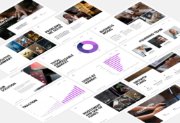
Organize your sections in a logical progression that builds on one another. You can see a great example of this structure for a 10-slide pitch deck in my other blog post here. This same organization can be modified for most presentations.
Additionally, make sure you use simple section slide designs with font sizes that are large enough to read, like the one shown below. (Remember, less is more in presentation design.)
Like a good book or movie, presentations need to build up as they progress.
03. Good Presentation Design Embraces White Space
In design, white space refers to blank space. This means limiting bullet points and the amount of text or images on slides. We should see a lot of your background color.
Naturally, we want our audiences to get the most amount of information possible, including figures, charts, imagery, and supporting ideas. If you’re new to presenting, you may even want to use your slides as a pseudo outline to remember what you want to say.
However, too much of anything in design tends to distract your audience from what’s being said. You want the audience to pay attention to your words, rather than what’s on the screen. This is for many reasons, ranging from short reading attention spans to how people process information.
So, it’s best to have only what’s going to support your verbal presentation on the screen and keep it to a minimum.
04. Organize Text
Speaking of how we process information, as you organize your slides make sure to follow a hierarchy with your text. Use a standard font, color, and size for your slide Headings, Subheadings, body copy, and footnotes.
This helps your audience scan-read slides quickly and allows them to process the most important information. We use this same concept in presentation design and web design. (Notice my section headings and subheading on this blog post.)
If this is for your company, you may already have a set of brand standards or a template you can use to make this even easier. Reach out to your marketing team to see if they have a template you can use.
Note how the title and headers attract your attention first. Body text tends to be read last.
05. Limit Colors
Presentation design is similar to interior design. In interior design, you want to minimize the use of clashing colors and knickknacks that create a sense of clutter. Like in interior design, you don’t want to add a lot of colors, textures, or fonts on your slides that could distract from your message and make your audience wonder why it’s there.
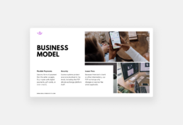
Again, this is where ‘less is more’ comes in. I recommend sticking to no more than 3 colors on each slide. It’s good to limit colors to one background color, one text color, and a pop of accent color used to bring special attention to something on the slide (e.g., icons, figures, charts, etc.).
06. Use Icons and Charts To Tell A Story
The saying “a picture is worth a thousand words” is actually backed by science. 90% of information transmitted to our brain is visual. Our brains are literally wired to process images much quicker than text or sound.
If you want to create more memorable presentations, it’s a good rule to add visuals that support the message or story you’re presenting. I like to include things like icons and charts. But remember, too much is never a good thing.
Keep your use of icons, charts, and figures to a minimum so they remain powerful and pop on the slide. There are several great examples of how to do this in my Pitch Deck article.
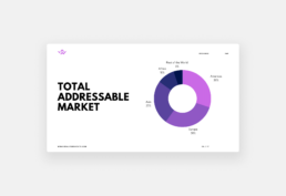
Our eyes are trained to process visual information faster. Convey your message visually whenever possible.
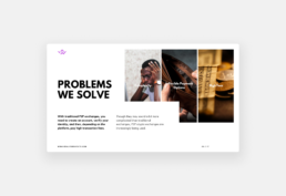
07. Image Backgrounds that Provoke Emotions
The best way to create a memorable presentation design is to make the audience feel something. Although we’re shooting for a ‘less is more’ approach to slide design, never underestimate the power of a powerful background image.
Using strong background images, paired with minimal text, can draw people’s eyes back to you if their minds start to stray. It’s also more likely to help people process the information you’re talking about.
Imagine pitching to investors how your product improves the chances of doctors catching life-threatening diseases. Having an image of a doctor and tearfully joyful patients may hit your investors right in the feels (and pockets). Or, imagine trying to convince an audience of millennial men in the mid-west to try your whiskey the next time they meet friends at a bar. Having images of forests and lakes might resonate with them and remind them of their favorite hiking or vacation spots. Thus, tuning them into your ultimate message – buy our product.
These are just a few examples of how background images can support your presentation. You can see this in action in a presentation template I did for Westward Whiskey and try it for yourself.
The same goes for images. Use them to support your text or reinforce your message.
Less Is More When it Comes To Great Presentation Slides
The best presentations rely on what is said and how that message comes across. Your presentation slides must support that message without distracting your audience. Using these seven tips to design your slides will help your audience retain the information you want them to and create a more memorable presentation overall.
If you find yourself wanting to include more data or information, consider creating an appendix instead. Appendixes are your best friend for keeping presentations powerful and to the point.
If you need help creating your next presentation design, reach out to me. I’ve been designing company presentations and pitch decks that infuse energy and excitement. Let’s discuss how I can equip you with a powerful slide deck design to support your next presentation.
Related Posts


Beyond Slides: Unconventional Presentation Formats That Will Wow Your Audience
Every presenter knows that great presentations are not remembered for the words…

PowerPoint vs. Keynote vs. Google Slides: The Ultimate Guide
Finding the right presentation software for your team is crucial. You want a…