

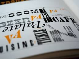
We human beings don’t just read fonts. We feel them. Fonts are more than just letters that spell out words and stimulate our minds. They are forms of art that stir our emotions.
The font chosen by a graphic designer is as important as the message they give. It’s as important as the pictures they use, the shapes and colors they choose, and the composition they create. In fact, all these components of a website create a feeling, a mood… they must all contribute harmoniously to that feeling, especially the font.
How to Select the Right Font
Fonts carry two languages:
- The Verbal Language: The meaning of the words
- The Visual Language: The feelings and meaning created by the visual appearance of the lettering
So first and foremost, the font you choose must evoke feelings in harmony with the ideas you are trying to convey. Research shows that readers take only 0.5 seconds to form an opinion about a website, and 94% of that opinion is based on the site’s design. Therefore, picking the right font is crucial to convincing readers that your site is the right place for them.
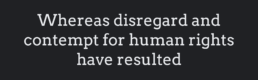
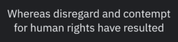
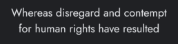
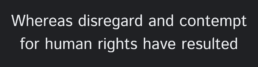
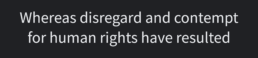
For example, if you are a law firm you want to project order, stability, power, and tradition, you wouldn’t choose this font for your law firm logo.
This makes you look inconsequential. If somebody in serious legal trouble went to your website and saw your logo or text in that font they would leave instantly.
No, Mackenzie, Baker, and Chance probably want something solid and timeless like this:
So choose a font that evokes a feeling that matches the personality of your business.
But there are other considerations when choosing a font as well.
If the website consists mostly of written content with small lettering, then the readability of the font is paramount. If the site consists mostly of images, then the aesthetic appeal of the lettering is uppermost.
Of course these two qualities, readability and aesthetic appeal, aren’t always in conflict, but they can be.
The Main Categories of Fonts and Their Uses
There are three main categories of fonts. They are:
- Serif
- Sans Serif
- Script
Serif fonts are usually older, slightly more decorative than Sans Serif with little lines or strokes that extend from each letter.
Sans Serif (literally: “without the serif”) has no lines or strokes to embellish the letter.
Script fonts are mostly decorative and appear to be handwritten. They are visually appealing but lack readability.
In general, each category of font will evoke these feelings:
Serif:
- Formality
- Elegance
- Romance
- Tradition
- Respectability
- Reliability
- Luxury
Serif fonts are generally used to associate yourself with history, institutional stability, religion, law, and established authority.
Sans Serif:
- Simplicity
- Cleanness
- Modernness
- Objectivity
- Ruggedness
- Youthfulness
- Coolness
Sans Serif fonts are associated with the modernist movement and the slogan, “Less is more.” Lettering without embellishment implies directness and honesty.
Script:
- Elegance
- Affection
- Creativity
- Femininity
- Beauty
- Delicacy
- Warmth
Script is often associated with love and wedding invitations, and is not a great font for “serious” reading. But there are many unusual scripts to convey a wide range of sometimes zany emotions.
Of course, there are thousands of fonts in each of these categories, and not all of them evoke the general feelings ascribed to each category. Indeed, there are as many fonts as there are human emotions.
Nonetheless, despite the vast variety of fonts in the world today, I’ll endeavor to identify and describe the 10 most popular fonts of the internet age and how to use each one.
Typography makes up to 80% of your design. A bold statement, I know, but do NOT underestimate the power of a good font.
Top 5 Serif
Before proceeding, there’s another kind of font category you need to understand. Some fonts are considered “reading” fonts, and others are considered “display” fonts.
I will break down the discussion into the two categories, listing the Top 5 Serif fonts and the Top 5 Sans Serif. The emphasis here will be on fonts that are used primarily for display, as opposed to those that are used primarily for reading.
01. Cinzel
Based on classical proportions, Cinzel is a typeface inspired by first-century Roman inscriptions. It exudes authority and elegance and is often used in the context of law, religion, marriage or established society, merging a contemporary feel onto it.

02. Bodoni Moda
Based on the work of Giambattista Bodoni in the late 18th century, the extreme combination of thick and thin strokes gives Bodoni Moda a flavor of elegance and creativity.
Bodoni is popular in logos, headlines, and decorative text. It’s also a staple of the fashion industry. It can be difficult to read and is seldom used where there is heavy text.
03. EB Garamond
Garamond is perhaps the most versatile font. In fact, a German publication, FontShop Germany, after exhaustive research, ranked Garamond the second most popular font in the world. It has widespread use in web design as well as in textbooks.
It is most famous as the former font of the Google logo.
04. Libre Caslon Display
Although this font is old enough to be a favorite of the famous printer, Benjamin Franklin, today this easily-readable Google font is popular in journals, books, and especially as a corporate typeface.
While all other digital Caslons revivals are based on 18th Century specimens by William Caslon I and William Caslon II, Libre Caslon is based on hand lettering artist Caslon’s interpretations typical of 1950s advertising.
05. Arvo
In many ways, Arvo breaks the mold for Serif fonts. Most other Serifs have an artistic, elegant, even slightly delicate appearance, but Arvo’s sturdy feet (sometimes referred to as “Slab Serif”) give Arvo a powerful, bold, and confident impression.
It’s often used in titles, headlines, and headers because it stands out brilliantly, but its clarity makes it also useful as text.
Top 5 Sans Serif
01. IBM Plex Sans
Along with Roboto and Open Sans, IBM Plex is a Google font equivalent to Helvetica and Helvetica Neue.
IBM was spending more than one million dollars a year licensing Helvetica, then after fifty years, they decided to commission their own typeface. With Mike Abbink leading its design and development, their new typeface was called IBM Plex. Thankfully, IBM decided to release it for free with no restrictions.
IBM Plex is simple and clear yet extremely versatile, perfect for use on Minimalist designs, both as display and text.
02. Jost
Jost feels most like Futura thanks to its sharp points and narrow widths. It works well in both headings and body text, but at heavier weights, it’s a less successful replacement. It was originally created by Owen Earl at indestructible type*, inspired by 1920s German sans-serifs.
With nine weights and italics, this is a sound choice for most display use cases. Set in all-caps and light or medium weights, Jost emulates the omnipresent Futura.
03. Libre Franklin
Named in honor of the printer who lived much earlier, Benjamin Franklin, Franklin is a 19th-century Sans Serif (the terms Gothic or Grotesque are earlier words for Sans Serif) It is most famous for its use in industrial design. Libre Franklin is an interpretation and expansion of this 1912 Morris Fuller Benton classic. Simple and sleek, it is often used in headlines and in advertising design as well but seldom as text.

04. Istok Web
Istok Web is the Google font version of Frutiger, a “humanist” font, meaning intentionally designed to stress clearness and legibility to the human eye. Some have described Frutiger as “the best choice for legibility in any situation”, while others have called it “the best general typeface ever.”
Istok Web is an original typeface, in development since 2008. It is used as small print and yet is very popular for signage and logo-making.
05. Source Sans Pro
Source Sans Pro can be used wherever an “edgy” or even futuristic look is preferred. It was Adobe’s first open-source typeface family, designed by Paul D. Hunt. It is a sans-serif typeface that works well in user interfaces.
Easy enough you say? Remember you need to ensure legibility across languages (special characters!), sizes, weights, and devices.
Mixing Fonts
Generally, you want more than one font on a webpage but more than three look busy and confusing. Designers have their own favorite combinations, but here are some general rules of thumb:
- Create contrast but avoid conflict: Contrast can include style, size, weight, spacing, or color. Avoid using fonts together that are too similar. But keep an eye out for how well the contrasts blend. Do the two styles complement one another or clash?
- Mix Serif and Sans Serif: This works best when you pair each font with one of a different size as well.
- Use fonts from the same family: This is easy and effective. Just mix the different weights, cases, sizes, etc. of the same font to create contrast without conflict.
Every designer has their own favorite fonts and font combinations, and choosing the most appropriate is a highly developed art and science.
Seventy-five percent of consumers say that they judge a website by its design. Don’t leave such an important part of your business up to trial and error.
Let Zamora Design handle your design needs.
Related Posts

Beyond Flat Design: The Rise of Neo-Brutalism and Textured Experiences
This year, I’ve seen a rise in Neo-Brutalism style design and textures. Find…

Sustainable Practices in Web Design for a Healthier Planet
Today's digital dependence means a higher environmental impact of our online…

sfBIG: A Non-Profit Website Re-Design & Branding Case Study
After successfully rebranding several non-profits, I was honored to be asked to…
Lessons From The Worst Rebrands in History
What were the worst rebrands in history? Let’s look at 7 lessons in bad…