Branding is one of the most important assets your company has – it’s your identity. It’s how you are perceived by the world. Branding encompasses everything from what colors are associated with you to communicating with potential customers.
Yet, as important as branding is, you may wonder why it’s hard to get your organization to understand your brand. Even more challenging, how to get your organization to be consistent with your branding?
The answer lies in your company’s brand guidelines. This blog will explain the 10 things you must include in your brand guidelines to create a contagious brand identity and how to effectively communicate that to your organization.
10 things to include in your brand guidelines
A brand guidelines document explains who you are in a clear, concise manner. It contains an explanation of the visual elements of your brand as well as the communication elements. Effective brand guidelines include at least 10 key aspects.
01. Brand Story
Just as every superhero has an origin story, so does your company. Your brand story is a recounting of how you came about. It should explain why you’re passionate about helping your target audience and align with your mission and values. (More on those later.)
Great brand stories are simple and stay with you. They are easy for people to remember because you want to be remembered.
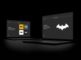
When crafting your brand story, think of Batman. Everyone knows the story of how Bruce Wayne became Batman – a son born to rich parents who loved their city and sadly met their demise at the hands of a street thief. This single moment led an adult Bruce Wayne to fight crime, get criminals off the street, and save the city he and his parents loved.
And in just three sentences of recounting Batman’s origin story you know 1) how he got started 2) his mission and 3) his values.
Batman has a solid brand story. What’s yours?
02. Brand Mission
Your mission statement tells the world who you help and how. Going back to our Batman example, his mission is to rid his city of criminals to make Gotham (his city) a safer place. Your mission may not be to fight crime, but it should be just as memorable.
A mission statement’s mission is to evoke an emotional response that aligns your ideal customer to your company.
03. Brand Keywords
Brand keywords are used to describe how you want to be perceived and how you act. You may want to be seen as authentic or an educator. Maybe you’re innovative or reliable.
Whatever words you choose, they will be feathered throughout your brand story, mission statement, and values. Encourage salespeople to use these brand keywords in presentations and when describing your company to others. Have executives use them in interviews. Encourage marketing to get creative with pairing these keywords to your services and solutions.
Eventually, the words you choose will be the words external people use when describing your company to potential customers.
04. Brand Values
Customers care about working with brands that share their values. They want to know what motivates you, as well as understand your company culture. That’s why it’s important to choose clear, actionable, and meaningful values. Your brand strategist will help you choose the right way to convey this.
05. Logo
Your logo will evolve with time. That’s why it’s important to have the most updated copies shown and linked in your brand guidelines.
I’m sure we all have stories of a time where an old logo version – maybe 5, 10, or even 15 years old – was found floating on company servers and used accidentally in a client-facing presentation. That creates confusion and a rift in your brand awareness.
Including the latest version of your logo in brand guidelines is the first step to prevent confusion. Then, you must train employees to refer to the guidelines to get logo links.

Alfred won’t always be around to fetch the latest version of the Batsymbol. Make sure it’s easily available to the whole team.
06. Color Palette
Your branding includes custom colors chosen by your company’s designer, usually between 4-6 colors. These colors transcend all aspects of your branding, from your logo to the color of links on your website.
Guidelines will also include how to strategically use these colors. For example, you may reserve specific colors as your “primary” colors and others as “accent” colors. It’s important to convey when and how often colors should be used, because the more consistent you are with color use, the more brand recognition you’ll create.
Just imagine if Batman had opted for a red cape – he might be mistaken for Superman. (Unacceptable.) We don’t want there to be any confusion on who you are. So, sticking to your color palette across creative, marketing, and web is key to communicate to your teams.
A CASE STUDY ON BRAND COLORS
A great company to look at how color consistency is tied to brand recognition is McDonalds.Those golden arches and red background are recognizable to people across the world. They use the same two colors consistently for years to create this effect.
But lesser known is how they use it subtly throughout all aspects of their company – from their kids meal boxes to their building’s red roof color to the red hair and shoes of their famous clown dressed in yellow stripes. McDonalds has woven these two colors into their brand so consistently that you can probably recognize a McDonalds happy meal box. In fact, you may even drum up warm memories of McDonalds kids meals as a child just by reading this.
That’s the power of a consistent color palette. You should strive to create the same consistency and brand recognition for yourself.
07. Typography
Your brand typography consists of all the fonts that fall under your branding. This includes things like your logo font, website header and body fonts, fonts your marketing team can use in graphics, and even the fonts used in your presentation decks.
Your guidelines should show how to use the different fonts properly and provide the links to install each font onto a computer.
08. Imagery Style
Keeping a consistent imagery style is important. Your brand guidelines should show your internal teams what styles to use in various situations. It will also provide links to important graphic assets, like approved icons, or imagery standards, like the dimensions all hero images must be on your website.
It’s important to be clear with your imagery styles guidelines, so marketing and web teams can comply. Include additional resources such as approved stock photo libraries and social media templates to increase brand consistency.
09. Tone of Voice
It’s important to decide on a single tone of voice for your brand and explain how to embody that voice in different situations. When determining your tone of voice, you will want to consider who your target audience is and what they respond to.
- Then consider tone of voice questions like:
- Are you informative and concise?
- Are you playful and regularly use stories to convey your point?
- Do you spell out words or allow contractions (i.e., cannot vs can’t)?
- Do you use emojis?
Imagine how you want to portray your brand in writing, then communicate that over 2-4 slides in your brand guidelines. Everyone in your company should be able to read these slides and mimic your brand voice and tone in external communications like emails, press releases, marketing material, sales collateral, or your website.
10. Resources Slide
I like to include a slide or two for resources in every brand guidelines I make. These slides include important links to stock images, fonts, PowerPoint templates, and logos.
Having all these resources linked in one place is crucial to ensure internal and external people have easy access to brand assets. This increases chances of branding being used consistently.

Your imagery must be consistent with your brand personality in general and tone of voice in particular. Details like the lighting of the scene or the pose of the models can make a difference.
How to effectively communicate brand guidelines to your organization
Now that you have the individual elements that make up your brand, how do you effectively communicate that to your entire organization? While you may think to create a Word document, much like your company handbook – don’t.
It’s important that guidelines are clear and memorable for your internal teams. Creating a 20-page Word document is hard to follow. Employees won’t want to comb through pages and pages of text.
The key to effectively communicating your brand to your organization is to create a presentation deck. The deck should be concise and add visual elements to help enforce graphic standards. (Pro tip: Whenever I have an excuse to include visuals – instead of text, I like to.)
And above all else, your brand guidelines presentation should be simple enough that anyone – from a first-day employee to an external investor- can quickly understand your brand.
Pro Tip: Your visual presentation should be simple, however it is ok to have a little fun when presenting your brand to the entire company for the first time. Using memorable stories and verbal examples – like comparing branding to Batman – goes a long way to help people understand the importance of adopting your brand guidelines.
Let me help you create an effective brand guidelines deck
There’s a lot that goes into creating a brand, and even more to getting internal personnel to adopt it. My team and I at Zamora Design help companies create effective, contagious brand guideline presentations for companies of all sizes. In fact, that’s part of my company mission – to stamp out bad presentations whenever and wherever I find them.
So, whether you struggle with brand consistency or are revamping your brand and need a new set of guidelines, I can help. Contact me and together we’ll create a brand your company gets.

Borja Zamora
A Barcelona native but San Francisco based, Borja explores digital marketing and design through articles, images, and quotes.
Related Posts
December 16, 2024
10 Groundbreaking Branding Trends Shaping the Future in 2025
Explore 10 innovative branding trends for 2025, from AI personalization to…
September 15, 2024
From Band-Aid to Popsicle: 12 Brands That Became Household Names
Great design is all around you. In our daily lives, we interact with objects…
August 27, 2024
The Secret Lives of Objects: Hidden Design Stories in Everyday Product Designs
Great design is all around you. In our daily lives, we interact with objects…
April 30, 2024
sfBIG: A Non-Profit Website Re-Design & Branding Case Study
After successfully rebranding several non-profits, I was honored to be asked to…


