How would you define “effective web design”? Most people think it involves some combination of colors, graphics, typography, copywriting, and flow. If you guessed any of these, you would be right. Mostly.
Beyond Aesthetics: The Role of UX Writing in Effective Web Design
The truth is, people overlook the critical role UX writing plays in web design. It never seems to make the list of website must-haves. For good reason; most people don’t know what it is.
In this blog, I’m going to explain what UX writing and microcopy are and why so many website owners are prioritizing them to keep modern users engaged. Plus, I’ll include real-web examples of effective microcopy and how to start incorporating it into your website.
What are UX Writing and Microcopy?
UX writing refers to a specific type of website copywriting. It’s often described as words that guide users through your site and help them to interact. It can also refer to the copy on pages meant to help users, like a 404 page. UX Writing is clear, concise, and conversational.
Narrowing down further, microcopy is a subsect of UX writing that helps users do things. Every website uses microcopy. It’s the text on your buttons, pop-ups, and error messages. Like with design, you have the choice to make this purely functional or use it to leave an impression on users.
Effective web design does both.
UX Writing is Crucial to Effective Web Design
And well. The most effective web design uses microcopy as a chance to create useful, delightful ways to leave an impression of their brand.
Notice the difference in the image example below. Ten years ago, you would expect to see something like the image on the left. You’d be hard-pressed to get a personalized greeting like “Nice to meet you, Graham.”
Go ahead, pause to take a look at the two.
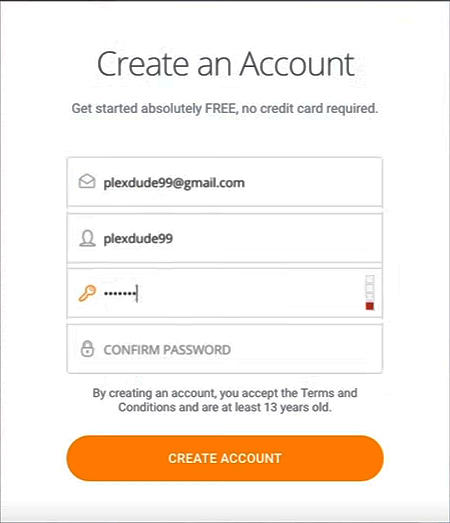

Did the small greeting on the right leave a warm feeling for you? That’s the point. Today, website users enjoy and praise brands that adopt this style of communication.
Another example can be seen here, with this add-to-cart pop-up. By adding a smiling face and turning shopping into a party, it makes the shopping experience more fun.

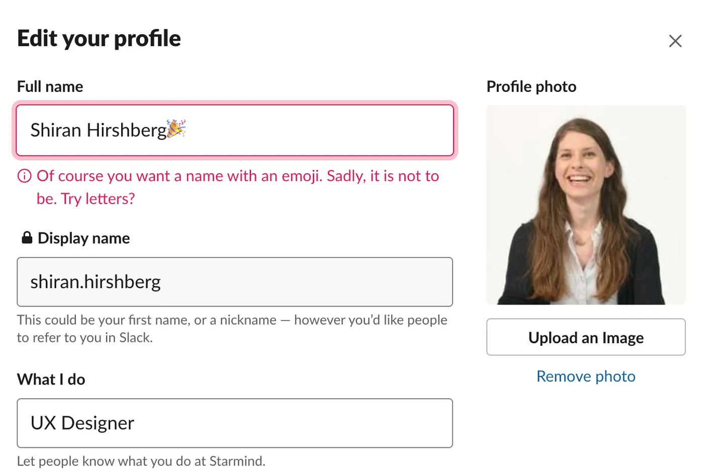
Instead of smiles, this brand chose to call out users who try to use emojis in their form fields. They could have left a dry message indicating the appropriate characters to use. This way is much more conversational. Smiling faces and emojis are small but popular touches to add to your UX writing.
Beyond warm feelings for the brand, there are several benefits to integrating strategic microcopy into your design. Not only does it enhance the user experience, but it also helps to:
- Avoid user mistakes
- Make the experience more conversational
- Reassure users and gain their trust
- Improve conversion rates
- Create a more fun, likable brand
Tips To Incorporate Microcopy That Resonates With Your Target Audience
01. Stay Consistent
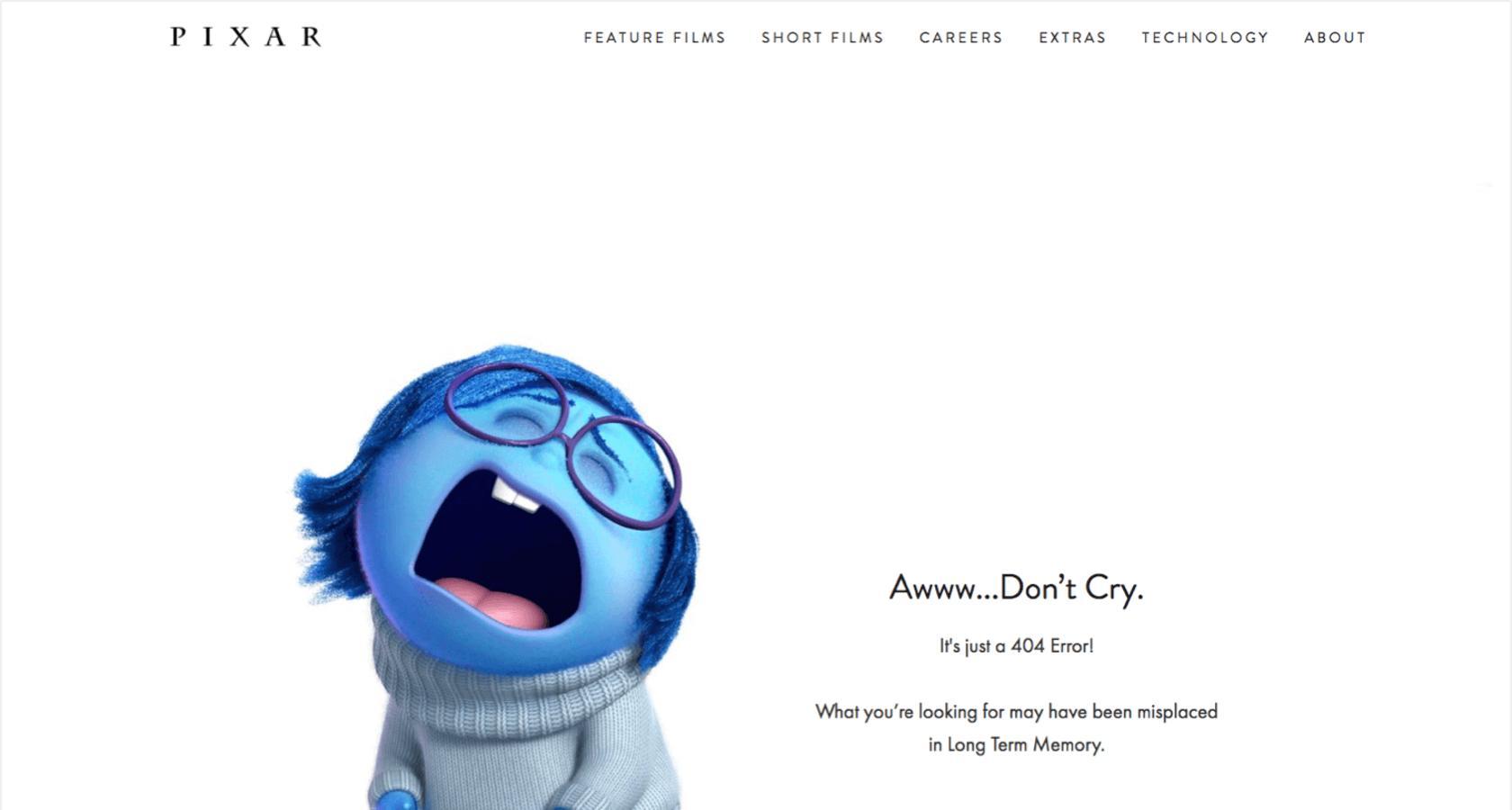
The shift to UX writing does not mean you need to shift away from your brand voice and tone. If you’re a professional organization, do not suddenly add emojis across your website. You can still play with a professional, pleasing microcopy. On the other hand, if your brand is fun or bold, it’s time to redesign your 404 page into one that matches your brand personality. It will resonate with your audience more and reduce friction.
02. Be Brief
Wordy storytelling has its place in effective web design, but not in microcopy. Brevity is your friend. It can be challenging to find quick quips without being too vague. There’s an art to giving direction clearly and concisely.
The easiest way to effectively use microcopy to convey your message is to use short sentences and bullet points. It breaks up lengthy paragraphs and leaves only the most critical details that visitors look for. For CTAs (calls-to-action) and buttons, get creative with your copy without dialing it back to a single word. Then, allow your visual design to assist the message.
Side Note: UX Writing is a breath of fresh air for many website owners and designers. It is your chance to practice brevity after years of being wordy to appease search engines.

03. Don’t Use Jargon
Sometimes you can’t escape industry terminology. That’s ok. Great web design and copywriting can intermingle, like the example below. When we’re talking about guiding users through your site (hopefully to whatever purchase or contact form you desire), you must be clear. Don’t risk causing confusion in your user journey. Stick to conversational copy that anyone, at any reading level, can understand.
If you need help, ask Notion AI or find a website plugin that scores your readability. Yoast is the most popular WordPress plugin that includes this feature. It will even give you tips to improve your writing.

04. Guide Users Through Your Website
Imagine your website as a highway. As the visual design drives users’ eyes down the page, microcopy acts as signs on the highway. It tells people where to turn next. Effective microcopy assists people without disturbing the design.
There are many great strategies for how to do this. Above all, placement and understanding your user is critical to know what and how to incorporate these road markers so it flows naturally with the design. Your web designer and UX copywriter will work as a team to find the right balance. Once launched, using software like Hotjar and Google Tag Manager Events will give you more data to continue refining your messaging.

05. Add Reassuring Copy
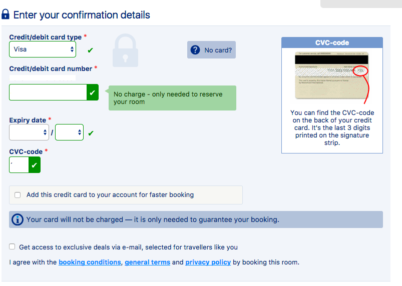
As you use UX writing to guide people through your website, make sure you’re also using it to reassure users. The better people feel about taking action on your site the more likely it will turn into a conversion.
Ways you can incorporate reassuring microcopy on your site are:
- Tweaking your form submission disclaimers to be lighthearted
- Adding engaging text in your search box
- Improving the copy on your popups
- Tweaking error messages to be more conversational
If you notice, all the areas on my list are all pieces of copy most website owners overlook. In reality, these examples of microcopy are actually micro chances you have to make people like your brand. Always ask yourself “will this make people smile?” If your answer is yes, make the change.


Concise Copy, Big Impact
To keep up with modern user expectations, it’s time we reimagine how to approach small snippets of text on websites. Nothing is an afterthought. Every word on the page is an opportunity to build on the user experience. (Even Google prioritizes helpful content now.)
Take another look at your website. Are you using UX writing well? If not, let’s discuss how to update your site into one that impacts users through design and directive copy.
Borja Zamora
A Barcelona native but San Francisco based, Borja explores digital marketing and design through articles, images, and quotes.
Related Posts
July 23, 2024
Beyond Flat Design: The Rise of Neo-Brutalism and Textured Experiences
This year, I’ve seen a rise in Neo-Brutalism style design and textures. Find…
May 31, 2024
Sustainable Practices in Web Design for a Healthier Planet
Today's digital dependence means a higher environmental impact of our online…
December 15, 2023
10 Design Trends in 2024
Ask anyone and they’ll tell you the market is shifting. Most are probably…
October 30, 2023
5 Questions Your Homepage Design Should Answer (B2B and B2C)
There are five questions your homepage must answer, and they stand between a…


