Have you noticed that flat design has quietly dominated for the past few years? With its simplicity, clean lines, and responsiveness, flat design quickly became the go-to choice for many designers. It’s easy to see why.
Flat design removes unnecessary elements, creating streamlined, efficient user experiences (UX) that work well across different devices. It also has a nostalgic charm that consumers love. But, as with any design trend, there’s always a shift on the horizon. Recently, a more layered and textured aesthetic has started to gain traction.
Neo-Brutalism Revisited
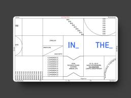
Neo-Brutalism is a design movement characterized by bold typography, raw materials, and geometric shapes. It’s a style that embraces stark contrast, drawing inspiration from the architectural Brutalism of the mid-20th century. It rose to popularity in the early 2010s and, while it never fully died out, it has been popping up more and more.
There are differences between the 2010s interpretation and today. Designers are modernizing Neo-Brutalism’s core elements to fit our contemporary tastes. The bold, bright colors are being interchanged with pastels and mixed with neutrals. The raw, unpolished look of Neo-Brutalism is being softened – slightly – making it more adaptable and appealing while still retaining its distinctive edge.
The Rise of Textured Experiences
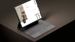
Now, I am not saying flat design is going anywhere. Design trends never fully fade away. But as flat design makes way for more focus on creating impact, there’s a growing interest in textured user interfaces (UI) that add depth and complexity for a more immersive design.
Designers are experimenting with:
- Subtle gradients
- 3D effects
- Photorealistic elements
All of which create more engaging experiences. These curated textures increase a design’s visual interest and create a tactile feel, drawing users’ eyes across the page. They bring a sense of realism and impact that flat design often lacks. I like to think that when done well they bring a pop of personality that demands attention.
Beyond Aesthetics: Balancing Texture with Functionality
While textured design can enhance visual appeal, it’s crucial to maintain usability and clarity. Overloading an interface with textures can quickly lead to clutter, which detracts from the user experience. The key is to integrate textures that support the overall functionality and hierarchy of information. Think of texture as seasoning a meal – you want enough to enhance the flavor, but not so much that it overwhelms. Balancing texture with clean, clear design ensures that users can still navigate and interact with ease.
The Future of Design: A Blend of Styles
Looking ahead, it’s likely that we’ll see a more diverse design landscape as trends flitter in and out of favor faster. Flat design, Neo-Brutalism, and textured UI will coexist, each bringing unique strengths. The challenge for designers will be to find the right balance for each project. We must consider the user’s needs and a client’s brand identity above all. It’s not about following trends blindly, it’s about creating designs that are functional, engaging, and true to the brand. This blend of styles allows for more creativity and flexibility, ensuring that designs remain fresh and innovative.
I’m excited about the potential Neo-Brutalism and textured experiences bring to move us beyond flat design. If you’re looking to incorporate these styles into your brand, reach out to me, and let’s discuss how to adapt your brand without losing its core identity.
Borja Zamora
A Barcelona native but San Francisco based, Borja explores digital marketing and design through articles, images, and quotes.
Related Posts
May 31, 2024
Sustainable Practices in Web Design for a Healthier Planet
Today's digital dependence means a higher environmental impact of our online…
December 15, 2023
10 Design Trends in 2024
Ask anyone and they’ll tell you the market is shifting. Most are probably…
October 30, 2023
5 Questions Your Homepage Design Should Answer (B2B and B2C)
There are five questions your homepage must answer, and they stand between a…
September 30, 2023
Docere Clinics: Web Design Case Study
Docere Clinics is a stem cell therapy center whose cutting-edge procedures…


