Ask anyone and they’ll tell you the market is shifting. Most are probably talking about stocks or home prices, but the same is true for design.
Design trends are at odds. On one hand, it’s exploding with the possibility of AI graphics and technology. On the other hand, consumers want more breathing room and insight into the environmental impact of design. They’re finding new ways to recycle and improve older trends. It’s an interesting dynamic that has me excited to share my 10 design trend predictions for 2024.
01. Flat Design 2.0
Flat design is a graphic design trend that became popular around 2012 thanks to big tech companies like Microsoft and Apple. It’s a 2D design approach that emphasizes flat elements, saturated colors, and simple fonts. I was sad to see it fade out but, like fashion, design is cyclical. Now we’re seeing the rise of its successor, Flat Design 2.0. The 2.0 version has all the simplistic elements of flat design we loved with a splash of Neumorphism. The Flat Design 2.0 enhancements include elements like the combination of flat and skeuomorphic design using understated shadows and gradients. It gives just enough to bring a breath of depth to your design and make it feel three-dimensional, and it’s just enough to be trend-worthy.
Characteristics of Flat Design 2.0
- Subtle shadows and gradients
- Highly saturated colors
- Simple fonts
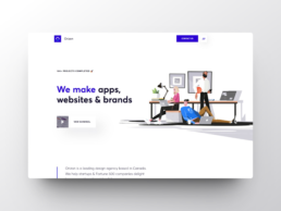
Canadian web design agency, Orizon, uses subtle shadows and highlights added to give the site a bit more depth and dimension.
02. Free-Form Layouts
Free-form layouts are a design style that breaks away from the predictable symmetry of grid design. It takes advantage of negative space and creates asymmetry in your design, often mix-and-matching text and visual elements. An additional benefit is that it also allows you to convey a lot of information more concisely. I like to use free-form layouts on home pages, across e-commerce sites, and portfolio pages. The truth is they can be used almost anywhere.
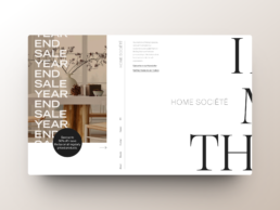
Interior design firm, Home Société, has created a mesmerizing experience through free-form and asymmetric layouts.
03. Negative Space
Speaking of negative space – it’s a design trend in its own right. Negative space, also called white space, refers to the overemphasized gaps of blank space within design. Think of it as the space between each grid tile on Pinterest. In web design, empty areas are used strategically to direct focus. It can be particularly powerful to direct the reader’s attention to product visuals and powerful snippets of text. In presentation design, it’s used to reduce on-slide distractions so the audience directs their focus on the presenter. As we move into 2024, I predict white space will continue to take center stage. Look forward to even more generous margins and breathing room.
04. Pastels vs Neons
In last year’s design trend prediction, I embraced the 90s nostalgia that brought back bold, high-contrast colors. In 2024 we’ll see another 90s flashback where pastels and neons play in the same design. And they don’t just compete, they complement. Pastel backgrounds paired with pops of neon accents bring a playful balance to websites, social media graphics, and ads. The contrast is good at directing focus. Add pops of animation or shadows to further direct the eye. Marketing teams will be the loudest proponents of this pairing. They will find more versatility and creativity by updating their color palette to include muted tones and bright colors.
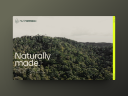
Nutramaxx delivers an outstanding experience through a one-pager with a captivating load animation and an excellent pastel + neon combination. Also worth noting is the animations within the accordion.
05. Microinteractions
Microinteractions are small, subtle animations that enhance the user experience with visual feedback. They are most common on websites and apps. The idea is to keep users engaged and encouraged on their journey. After all, our attention spans only seem to get shorter by the year. Microinteractions can keep users on your site longer, increasing the conversion potential. Creativity and playfulness fuel these elements with some of the biggest names in tech, like Asana and Google, showing us how to master the art of subtle animation. The best part is that you can enhance your website and app designs. 2024 will see more opportunities for businesses at all levels to use microinteractions to improve conversions.
Examples of Microinteractions:
- Progress bars on blogs
- Asana’s task completion unicorn
- Mouse-over effects
- Google’s no connection 2D dinosaur game
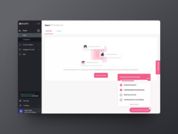
Microinteractions shine when they enhance the user experience by providing subtle information. Userpilot integrates progress bars into its onboarding checklists so you never wonder where you are in the process.
06. Subtle Motion Design
Our eyes are attracted to movement. So, it shouldn’t surprise you that designs often aim to take advantage of this. A great way is to use subtle motion freckled throughout your design. On websites, it may be a mouse-over effect or a slight sway to graphic elements on the hero. In graphic design, animators may add a slight wave effect in a small pattern. Regardless of the method, the effect is the same – attention. Subtle motion design works well on the web, social media, and graphics for ads. We saw this start to grow in popularity in 2023 and I suspect we’ll see it explode in 2024.
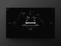
Nerisson is a freelance web and motion designer who showcases subtle effects straight from the homepage to keep things interesting.
07. AI-Powered Design
AI continues to grow and amaze us with its potential. 2023 saw an uptick of uses in the design world, like AI-driven image upscalers, project management, and more. Perhaps the most exciting result (from a designer’s perspective) is its explosive impact on art. Generative art is the use of AI and algorithms – along with specific boundaries set by the creator – to create artistic visuals, patterns, and graphics in a unique, non-static way. In other words, it lets us use a computer to sift through thousands of artistic concepts in milliseconds to find a new and unique piece of art. The results I’ve seen online have been stunning. I can see 2024 being the year we start to incorporate it more in both graphic design and web. With it, we can use prompts to add depth to our marketing campaigns, presentations, and website graphics. Generative art can allow us to push the bounds of design if we let it.
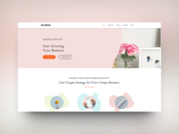
Go Grow is a Canadian digital marketing agency. Their website is powered by Bookmarks AI assistant AIDA.
08. Illustrations
Images are now easy and cheap to produce. They’re accessible, which makes high-end brands sit on the same playing field as any other brand. Both can create the same look. So, what happens when the expensive becomes common? You go back to simple. Scale down the flash. You go back to illustrations. Custom illustrations are the new high-end because they still require time and skill to create. It’s more expensive. I predict as AI and images continue to get easier for people to create and flood the market, we’ll see more and more high-end brands shift to illustrations to set themselves apart.
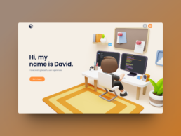
David Heckoff’s portfolio website is a masterpiece of 3D illustrations and animations. Check out the bottom of the page, where a 3D character morphs into a picture of David.
09. Sustainable Design
Green design initiatives and ethical practices have become more mainstream. Designers and consumers are interested in reducing the energy consumption associated with running websites, apps, and smart technology. Thankfully preference parallels intention in this case. Many design trends we see naturally help reduce resource usage. Dark mode, muted colors, SEO, and flat design 2.0 are all examples of ways to reduce energy use. It’s a slow road to becoming a fully sustainable design community, but I believe we’ll see more shifts in 2024 to get there.
Examples of Sustainable Design Trends:
- Dark mode
- Lo-fi images
- Optimized code
- Font-focused heroes
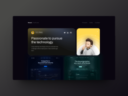
I like front-end developer Necati Koçlu’s dark mode website featuring smooth animations within a bento grid.
10. Conversational Design
Conversational design isn’t a new concept. Chatbots and live chat options have been around for years. However, with the increased use of smart technology in our everyday lives, like Amazon Alexa, we see new opportunities for conversation design. Users are interacting with our designs in new ways. We need to ensure our designs are ready. The simplest way to incorporate conversational design is to add a chat feature to your website. Even service-based businesses, like myself, can do this to enhance the user experience. You can build on this concept with more advanced interactions like video response-driven chat boxes and AI chatbots. Setup can be challenging, so enlist a UX expert to help you think of engaging ways to create conversations.
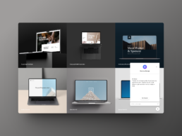
Did you notice the chatbot on my homepage? It does a lot of cool stuff (on my end) when you interact with it. Give it a try!
Keeping up with design trends
While I love writing these design trend listicles every year, I always end up wary of the impact they may have. I fear that someone, somewhere will read this blog and feel the need to scrap their entire branding and website to keep up with the Joneses. That’s not what I’m saying at all.
Trends will always have a place in your designs. They help you connect to what consumers are into at the moment. However, trends are meant to be picked apart, adapted, and even ignored if it’s at the cost of your brand identity. Your brand is your business. Having instant customer recognition is worth more than a thousand thumbs-up emojis on Facebook. So take each of these trends with a grain of salt. Play with them. Adapt the ones that make the most sense to your branding.
Contact me if you’re ready to experiment with your brand without compromising your brand identity. We can collaborate to find the right elements to drive your 2024 conversions.
Borja Zamora
A Barcelona native but San Francisco based, Borja explores digital marketing and design through articles, images, and quotes.
Related Posts
December 16, 2024
10 Groundbreaking Branding Trends Shaping the Future in 2025
Explore 10 innovative branding trends for 2025, from AI personalization to…
December 12, 2024
10 Innovative Presentation Design Trends to Watch in 2025
Explore the top ten innovative presentation design trends for 2025 that will…
December 9, 2024
10 Innovative Web Design Trends To Watch In 2025
Explore the top 10 web design trends for 2025, including AI personalization,…
December 5, 2024
How to Become a Freelance Powerpoint Designer (Part 2)
Discover essential strategies for becoming a successful freelance PowerPoint…
