Learn about 2021’s most popular presentation design trends and how you can use them to improve your presentations.
2021 has brought on a whirl of change. With the continuation of the pandemic and stay-at-home work, an increased concern about racial equity and climate change, as well as a general sense of uncertainty, it’s no wonder this year has permanently changed the way we think, behave, and run our lives.
This general shift in mindset is reflected in many of this year’s design trends. Here are 10 presentation design trends that set the tone for 2021, and will probably continue to be popular in 2022.
01. Rich Visuals
For over a decade, social media has been contributing to the shortening of our attention spans. With the recent increase in online work, people have to pay attention to a video meeting, a chat, notes, and projects, all at the same time. Between all this, our attention is split up more than ever.
A few sentences of text on a neutral background is simply not going to get someone’s attention anymore. Make your slides more stimulating by adding lots of complex and interesting visuals.
02. Animated Slides
Sometimes, no matter how interesting a visual is, it just doesn’t grab as much attention as animation. Everyday, 35 million Powerpoint presentations are given across the world—many of which contain visuals. However, a whopping 79% of audiences still believe the presentations they view are boring.
Humans are naturally attracted to movement over visuals. How quickly do you notice a rustling in the leaves versus a pretty, but stationary flower?
Take advantage of this instinct. Draw attention to important points and data with animations.
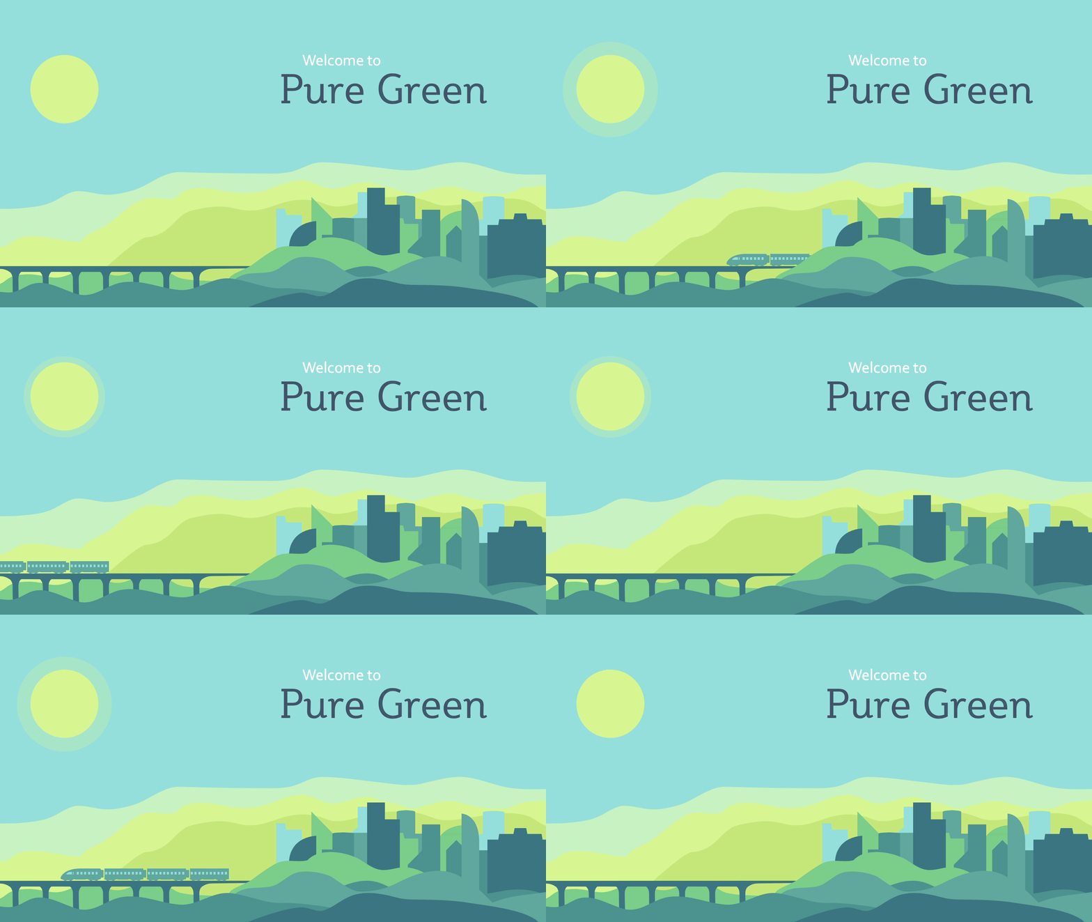
Draw attention to important points and data with animations (but don’t overdo it).
Source: brightcarbon.com
03. Minimalism and Simplicity
If a few sentences on a neutral background is boring, a giant paragraph is worse. Adding images and movement might add liveliness, but they also create clutter. While trying to pay attention to every little detail, the audience will fail to remember the main points.
With constant overstimulation, people are tired and want a break. They simply don’t have the bandwidth to process more than they have to, or to mentally sort what is and isn’t important. Try to be as simple as possible while still conveying your point, in both images and text.
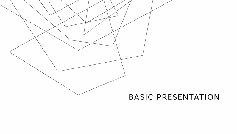
2021 has been all about clean and minimalistic designs.
04. Muted Pastels
Although bright colors intermittently come in and out of fashion, 2021 has definitely called for more relaxing, understated tones.
When everything seems loud and overwhelming, a muted color palette can feel trustworthy. Pastels are neutral and dependable, and can create a much needed sense of ease with the audience.
05. Earth Tones and Elements of Nature
In a similar vein, earth tones and natural, organic design elements have seen a giant uptick in 2021.
Whether it’s the increased attention toward being eco-conscious, or just another form of craving something dependable and neutral, people want to see nature-inspired design. If it makes sense with your subject matter, try to include some greens, browns, and plant-inspired graphics.
06. Retro Feel and Serifs Font
Stay-at-home orders have promoted a domestic lifestyle that is slower and meditative. This has caused many people to reflect on how life was in the past, before the fast-paced world of instant information and social media. Whether this means looking back at the 1840’s or the 1980’s, people are appreciating callbacks to past generations.
Although clean sans-serif fonts have been popular recently, consider using a serif to add some retro charm. It will create a feeling of warmth, stability, and trust with the audience.

For those tired of minimalism, retro designs and serif fonts have made a comeback in 2021.
Source: creativemarket.com
07. Dark Backgrounds With a Neon Punch
If retro and organic isn’t your thing, don’t worry. In a sleepy, monotonous world of staying inside all day, some people want something bold to wake them up.
Dark mode on apps has become incredibly popular in 2021—possibly because of increased use of apps like Discord and Zoom, or because of trying to reduce eye strain when staring at a computer all day. Either way, dark backgrounds have become trendy in design.
Try mixing it up by utilizing a dark background and light, bright text and visuals. Make your content pop and increase viewer attention even more by adding accents of neon.

Another 2021 trend: cyber-design with black or dark backgrounds and neon or fluor colors.
Source: elements.envato.com
08. Gradients
Over the course of the 2010’s, we saw an overwhelming trend of flat, solid-color designs. In 2021, people are tired of simple, boring colors and logos, and are craving more interesting designs.
Gradients can add an extra element of beauty and depth to an otherwise simple design. Done correctly, they can create a subtle complexity, without being obnoxious or overstated. Try using them on background colors or in small to medium design elements to add some subtle flair.
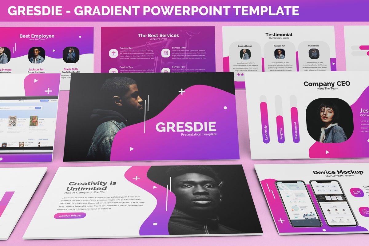
Gradients almost always elevate your design, giving your colors a richer and more nuanced look, and showing attention to detail.
Source: poweredtemplate.com
09. Social Media Slide Decks and Self Evident Presentations
In the modern world, content is all about being easily shared, replicated, and accessible. This makes a presentation that does not need a presenter inherently valuable—if it can stand alone, it can be used more.
With social media slide decks, you can convey important information in an easy-to-consume way. You can avoid cramming information onto one page or image, and you can also avoid asking an audience to sit through an in-person presentation.
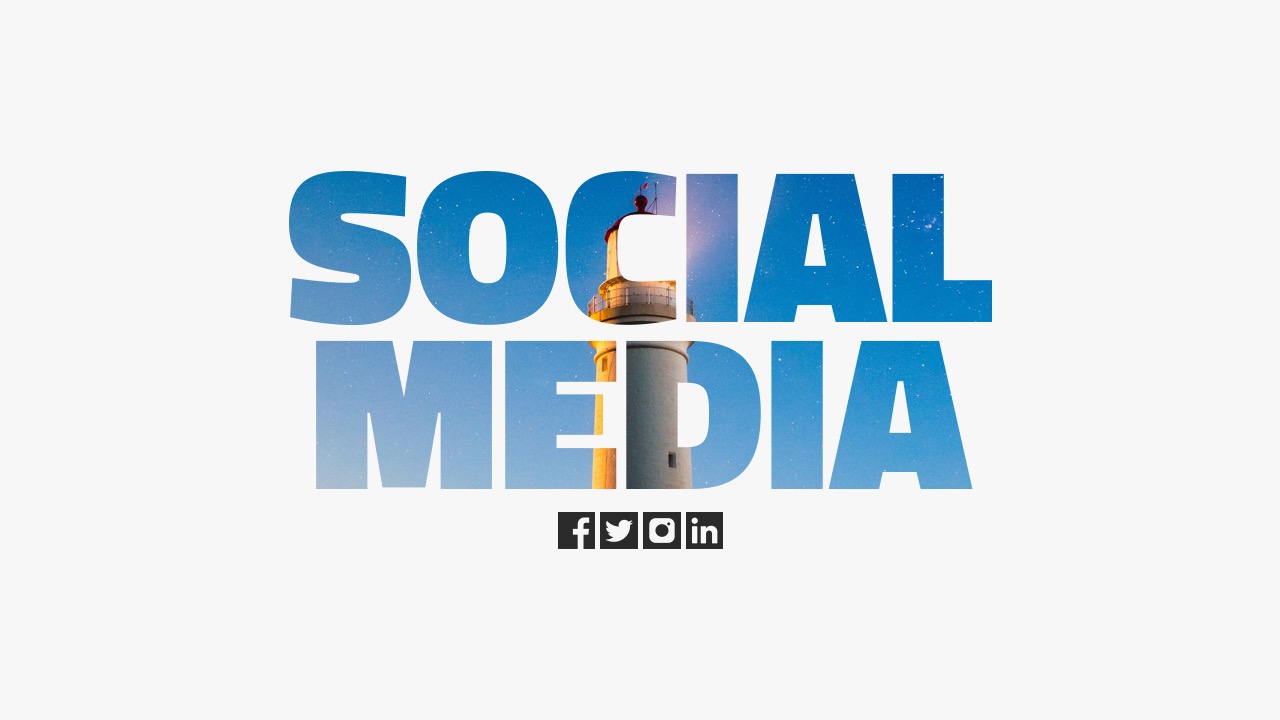
The lines between presentations and social media are intentionally blurred sometimes.
Source: graphicriver.net
10. Authenticity and Empathy
Above everything else, the most important 2021 trend is authenticity and empathy. Today’s audience is skeptical of marketing, and desperately craves the human touch the pandemic has stolen from them.
Include content in your presentation that conveys a feeling of relatability and understanding with the audience. Connect with them on a human level rather than being distant and detached. Acknowledge their concerns, ethical values, and personhood. Use expressive characters to add a sense of relatability to your presentation.
Need help using some of these trends, or just want to know more about effective design?
Contact me to learn more. With our expertise, we can elevate your presentation and help you tell your story.

Above all, 2021 tried to show empathy and understanding with authentic and approachable designs.
Source: typetalk.com
Borja Zamora
A Barcelona native but San Francisco based, Borja explores digital marketing and design through articles, images, and quotes.
Related Posts
December 12, 2024
10 Innovative Presentation Design Trends to Watch in 2025
Explore the top ten innovative presentation design trends for 2025 that will…
December 5, 2024
How to Become a Freelance Powerpoint Designer (Part 2)
Discover essential strategies for becoming a successful freelance PowerPoint…
December 5, 2024
How to Become a Freelance Powerpoint Designer (Part 1)
Unlock the secrets to becoming a successful freelance PowerPoint designer.…
September 18, 2024
Crafting Compelling Strategic Narratives: A Deeper Dive
Strategic narratives, the compelling tales that businesses weave to convey…
