Great design is all around you. In our daily lives, we interact with objects that designers spent hours - years - meticulously conceptualizing just to make your life easier. (And of course, some just fell into their design by happy accident.)
You may never sit and daydream about why things are designed the way they are, but someone did. Every detail, no matter how small, has a purpose, often rooted in practicality and user experience. Keep scrolling and let’s look at nine everyday product designs, some with hidden features you may not be taking advantage of.
The Pot Handle Hole — Surprisingly Useful
Ever noticed the hole at the end of your pot handle? It’s not just for show. This small design feature doubles as a spoon holder, allowing you to stand your hot, used cooking utensil inside it without making a mess on your counter. It’s a simple yet effective way of adding convenience without creating additional clutter — a principle that’s just as valuable in design, where small details can significantly improve user experience.

From thekitchn.com
The Keyboard Bumps on ‘F’ and ‘J’ Keys — Traffic Controllers for Your Fingers
Unless you’re old enough to remember having to take a typing class in school, you may not know what the tiny bumps on the ‘F’ and ‘J’ keys of a keyboard are. They’re not the speed bumps of the computer industry. These tactile guides were introduced in the mid-20th century when typewriters became popular in the workforce. They’re meant to help you position your pointer fingers correctly on the keys without looking, enabling smoother and more efficient typing. They worked so well they’ve survived the leap from typewriters to modern keyboards.

From boldsky.com
Tiny Pocket in Jeans — Nostalgically Obsolete
Have you ever wondered what that mini pocket inside your jeans’ front pocket is? It’s called a watch pocket, and it was designed to hold a gentleman’s pocket watch. It was a surprisingly functional strip of fabric. This design dates back to the 19th century, when Levi Strauss & Co. added the pocket to their jeans in the 1870s. It was a great selling point back then. Today, while you don’t see many people strolling down the street with a pocket watch anymore, the pocket is still in most jeans manufactured today.
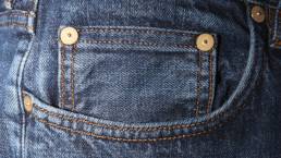
From huffpost.com
Soda Can Tabs — The Unsung Beverage Hero
The soda can tab is probably one of my favorite product design factoids. Originally, the tabs were invented in the 1960s, but the modern pull-tab was invented by Ermal Fraze and revolutionized the way we enjoy canned beverages. By eliminating the need for a separate opener the soda can could be taken on the go, making it even more popular. As for the whole inside the tab, that wasn’t always there. You’d think it’s purpose is to make opening the can a little more comfortable to open, but it’s not. The hole in a soda can tab isn’t there to open the can at all. It was designed to hold your straw in place, preventing it from floating out. This clever dual-purpose design always reminds me of the importance of thinking about how to incorporate functionality and the user’s experience into your design.
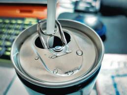
From star999.com
The Hole in a Spaghetti Spoon — Bringing Function to Your Kitchen
Similar to the pot handle hole, the hole in the center of a spaghetti spoon is a perfect example of form meeting function. It is designed to measure out a single serving of dry spaghetti. And even when you’re serving more than one person, it allows you to measure out one serving per person you’re feeding. Now, this is entirely useless when measuring other types of noodles, like Rotini or Macaroni, but remember – the spaghetti noodle was around years before any other shape of noodle. It’s been a staple in Italy since at least the 12th century.So next time you fire up a pot of water, check your spoon and test out its measuring capability.

From mashed.com
The Arrow Next to Fuel Gauge — Visual Cue in Automobile Design
The small arrow next to your car’s fuel gauge is a subtle lifesaver, pointing to the side where the fuel cap is located. This tiny detail is all about reducing your cognitive load – making it easier for you to refuel without a second thought. It was introduced in the late 1980s and early 1990s to help everyday drivers and those who frequently rented or borrowed cars. It still comes in handy when you’re having to navigate your way through a busy gas station parking lot. I am not proud to admit how long it took me to realize its function.

From huffpost.com
That Extra Shoelace Hole — Designed for Stability
Runners will know this one. That extra shoelace hole at the top of your running shoes? It is not for show. It’s designed as a “heel lock” or “lace lock,” a technique that prevents your foot from sliding forward in the shoe and reduces the chance of blisters. The “lace lock” technique has been around for decades, but it gained wider recognition as more people took up running and hiking in the 1970s and 1980s, when shoe manufacturers increasingly emphasized foot stability and comfort. Since then running, hiking, and everyday shoes have adapted it for extra stability. So next time your shoe feels a bit too roomy, remember this and try lacing it up more.
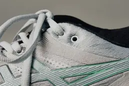
From gearpatrol.com
Pom-Poms on Hats — Fun and Fatally Functional
Pom-poms on hats aren’t just a fun decoration. They were originally added to naval sailors’ hats dating back to the 18th century to protect their heads from bumping into low ship ceilings. The pom-pom created a cushion – the bigger, the better. They were particularly popular in France. This functional design is more of a fashion trend now, but it shows how utility-based design decisions can evolve into trends over time.

From farmersalmanac.com
We Can Learn A Lot From Everyday Product Design
Every design choice tells a hidden story. Each of these products, while seemingly simple, reveals a thoughtful design aimed at improving user experience (even if the user doesn’t find it life altering). The lessons here apply just as well to any type of design – branding, web, or presentation design – where every detail should be crafted with the user in mind. So think of this blog next time you’re cooking spaghetti or put on your favorite winter beanie and remember how much detail went into your everyday item.
Borja Zamora
A Barcelona native but San Francisco based, Borja explores digital marketing and design through articles, images, and quotes.
Related Posts
December 16, 2024
10 Groundbreaking Branding Trends Shaping the Future in 2025
Explore 10 innovative branding trends for 2025, from AI personalization to…
September 15, 2024
From Band-Aid to Popsicle: 12 Brands That Became Household Names
Great design is all around you. In our daily lives, we interact with objects…
April 30, 2024
sfBIG: A Non-Profit Website Re-Design & Branding Case Study
After successfully rebranding several non-profits, I was honored to be asked to…
March 22, 2024
Lessons From The Worst Rebrands in History
What were the worst rebrands in history? Let’s look at 7 lessons in bad…

