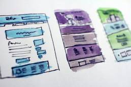
In a competitive environment, internet users demand an intuitive and enjoyable experience. Here’s how to deliver.
Website user experience has come a long way since the days when we still called the internet The World Wide Web.
An unacceptable internet user experience is no different than going to a clothing store with empty boxes strewn everywhere and with shirts and pants, mens and womens clothing, and different sizes of clothes all thrown together on the same racks.
If a woman was looking for a certain size blouse in such a store and had to search every item throughout the store to find what she needed, she would leave immediately.
That’s what navigating websites that don’t have satisfactory user experiences is like. Instead of providing a simple, logical, and enjoyable experience, the poorly designed website leaves visitors confused and frustrated.
So don’t make your visitors and clients suffer through a bad user experience. Use these 5 tips to make the browsing experience more enjoyable for your visitor and more profitable for you.
01. Don’t Make Your User Think
The internet is there to make life easier, not harder. If your visitor has to figure out your website, they’ll get confused and go somewhere else. Here are a few ways to make the internet experience more intuitive for the user:
- Use Standard Conventions: Put the menu at the top with clear tabs. Put the logo in the top left corner and make that the gateway to the homepage. Have a clearly visible search bar, login, and contact button near the top right and social media links at the bottom. There are numerous conventions that most users have come to expect. Learn them. Follow them.
- Be Consistent: Each page on your website should have similar visual formatting and follow the same navigational rules as every other. And your branding online should be consistent with your branding offline
02. Be Brief, Simple, and to the Point
The user came to your site for a reason. Know who your user is, why they came, and fulfill that purpose quickly. Everything on the site should be purposefully directed to fulfill the user’s expectations. Provide valuable content and avoid clickbait at all costs.
Most visitors scan sites rather than really read. So use headlines and headers effectively to emphasize the main ideas and guide the visitor to where they need to go. Keep text simple and to a minimum. Use bullets whenever possible.
Preserve lots of white space, use images and graphics, but don’t let the site become cluttered. According to research, Minimalist designs increase click-through rates.
Stock photos are annoying, inauthentic, and should be avoided as much as possible.
Ultimately, the point of every design should be to direct the visitor to the one, clear, unmistakable call to action which should be attractively placed on every page.

Understand your users, figure out their needs, and address them as quickly and effectively as possible.
03. Use a Clear Hierarchy
Hierarchy means distinguishing between those things you consider important and those that are less important. Obviously, you want to direct the visitor’s attention to the things that are most important. There are three types of design hierarchies to consider:
- Navigational Hierarchy: Make the navigation logical. The navigation menu buttons should flow from left to right in order of importance: most important to least important. When tabs drop down, they should also be organized hierarchically. Navigation should be structured like a tree with branches in a way that makes intuitive sense to the user. No surprises or confusion.
- Typographic Hierarchy: Use larger and bolder print for that text that has the most importance, and use an appropriate font or fonts to convey a feeling consistent with your message.Too many fonts or harsh color combinations should be avoided.
- Visual Hierarchy: The composition of the layout should direct the user’s eyes to the main subject of the page using basic principles of art theory: size, weight, color, position, and contrast. The layout must be attractive but also point the visitor’s attention to the main thing you want them to notice.
Hierarchy, especially visual hierarchy, is where the science of web design meets the art. And it’s one of many reasons why so many people prefer professional help with their web design, like the kind I provide here at Zamora Design.
04. Understand Your Demographic
Know the type of user who wants to access your site. Is your target audience viewing your site from a desktop computer in the C-suite, on a tablet in a nightclub, or while walking to the subway station on their cell phone? Are they stay-at-home moms, construction workers, or executives?
The list is endless, but being able to narrow down your audience is crucial in improving your site’s user experience. The demographic profile of who is on your site, their time constraints, their location, and the type of device they use are all factors that need to be considered when designing your site.
If your site is not optimized for mobile use but your primary audience uses their phone more than a traditional desktop, you will miss your target. Larger font size that is easily readable might be the best approach when you’re trying to reach an older demographic.
The bottom line is, everything is in the details when it comes to creating the best user experience. Consider everything from colors to headings to how intuitive your site is to use and how it relates to your demographic to get it done right.
05. Avoid Annoying Computer Glitches
This one is so obvious it can be easily overlooked. And yet nothing is more annoying than technology that interferes with your experience on the internet. Here are a few of the most common glitches:
- Slow Response: They say that on the highway speed kills. But on the internet, slow speeds kill. According to research, an extra three seconds of page load time can increase your website’s bounce rate by more than 40%. So keep your website optimized.
- Catch Redirects and 404’s: Keep an eye on your analytics and spot pages with high bounce rates or broken links. No one likes to be at a dead end, and if that’s where a visitor ends up, they’ll just leave.
- Avoid Friction: Minimize ads, pop-ups, subscription boxes, information about cookies, etc. Some of this can’t be avoided, but too many distractions and useless bells and whistles that the designer himself might import are distracting, annoying, and will drive the visitor away.
How You Could Benefit from Professional Design Help
95% of users have reported that user experience is the most important factor when visiting a website. And 75% of users judge a company’s credibility based on the design of their website.
Internet design is the one part of your business you simply can’t neglect. As many as 94% of users reportedly bounce from a website if they feel it has degraded design characteristics. And perhaps that is why researchers have found that for every $1 spent to improve website user experience, there is a $100 return.
There is a highly-evolved art and science to creating a pleasing user experience on a website. It doesn’t happen without precise knowledge and understanding.
Don’t leave your website design to chance. Let an expert create a beautiful web design just for you that your visitors will love.

Borja Zamora
A Barcelona native but San Francisco based, Borja explores digital marketing and design through articles, images, and quotes.
Related Posts
December 9, 2024
10 Innovative Web Design Trends To Watch In 2025
Explore the top 10 web design trends for 2025, including AI personalization,…
July 23, 2024
Beyond Flat Design: The Rise of Neo-Brutalism and Textured Experiences
This year, I’ve seen a rise in Neo-Brutalism style design and textures. Find…
May 31, 2024
Sustainable Practices in Web Design for a Healthier Planet
Today's digital dependence means a higher environmental impact of our online…
December 15, 2023
10 Design Trends in 2024
Ask anyone and they’ll tell you the market is shifting. Most are probably…


