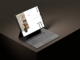
Minimalism in design: can it be too simplistic? Today, Minimalism in graphic design dominates, and almost everyone agrees that this is a good thing. But too much of anything, even simplicity, is not always a good thing.
Today, Minimalism in graphic design dominates. And almost everyone agrees that this is a good thing.
At least most of the time.
After all, who wants to go back to the days of this kind of internet design?

It may be striking and bold, but it’s also garish, ugly, and – most of all – totally confusing.
As digital capabilities for graphic design continue to evolve, designers have generally adopted the age-old Minimalist doctrine that “less is more.”
Or, as the great Leonardo DaVinci once said:
“Simplicity is the ultimate sophistication.”

What Is Minimalism in Graphic Design?
The keys to Minimalism in graphic design are simplicity, focus, order, harmony, and balance.
One important goal of the graphic designer is to strip away all distracting elements from a design. There is humility in this approach.
The intent is to focus the viewers’ attention exclusively on the subject or product. The less the viewers notice the design itself, the better the work of the designer, and hopefully, the better the design will convert.
The Key Elements of Minimalist Graphic Design
01. Simplicity
Less is more. With fewer items in the design mix, the viewers can better understand the product itself and have their attention guided to the desired goal.
02. Neutrality
Limited use of colors and simple fonts. Bold colors and contrasts are used sparingly, mainly in a way that directs the viewers’ attention to the product.
03. Balance and Harmony
With fewer elements in the design mix, anything inharmonious or out of balance becomes particularly distracting. Minimalist graphic designers use a grid system to ensure that harmony and balance remain essential to their design.
04. Establishing Hierarchy
The goal is to methodically direct the viewers’ eyes to the subject. Composition is used to assign visual priorities, ultimately focusing on the product.
05. White Space
Simple backgrounds help keep the focus on the hierarchy and on the subject itself.
Here is an example of effective Minimalist design.

Source: ad for Ritual Vitamins, created by Jessica Yan.
All the elements of Minimalism are present here. There are very few items in this picture, and they all relate to the product.
There is only a tiny splash of color and only one contrasting element. The composition is balanced and points the viewers’ eyes to the product and the simple slogan, which uses a basic, easy-to-read font.
With only six words of text, the viewers know what this product is and the overall impression is that this product will promote health naturally.
The Pitfalls and Limitations of Minimalist Design
Minimalism is the default style in digital graphic design. But in practice, Minimalism is not always appropriate.
Minimalism has become a dogma. Some believe that it has even taken on moralistic overtones, that an affinity for Minimalism is a signal of moral superiority, and it is sometimes employed without a real marketing purpose.
When Minimalism becomes dogma, it misses the point and can, at times, actually impede the effective and attractive presentation of a brand or product.
To be effective, Minimalism must be executed properly, and it should only be used when it is the most effective style option.
Some common objections to, limitations of, and possible misapplications of Minimalism are beginning to emerge.
When You Should Avoid a Dogmatic Minimalistic Approach
It’s important for designers to understand the pitfalls of being too simplistic or Minimalist in your design approach:
Minimalism can entirely miss the mark.
Some products are complex. Naturally, consumers of those products will want to understand that complexity. Whenever the consumer needs detailed content, too much simplicity is insufficient.
Some brands simply require a different style.
There are times when a brand is so personal that it necessitates the kind of detail that Minimalism wants to reject. For example, many fashion brands want to appear exciting and brash to a particular audience, not merely “simple.”
Some markets just won’t respond to Minimalism.
Elegance, sophistication, beauty, simplicity. These design elements are not necessarily for everybody. Some audiences prefer a creative edge and won’t respond to design that is too simple.
Minimalism can overlook exciting new design trends.
Recent styles that don’t always conform to Minimalist criteria are Abstract Psychedelia and Fine Art Infusion, among others. User-Centered Design is a very strong design trend in the tech industry
Some of the criticisms of Minimalism are not so much about the theory but how Minimalism is actually practiced.
Common Misapplications of Minimalism
- Design that does not convey a strong, clear message
- Simplicity to the point of vagueness that leaves a visitor confused about navigating a site, the opposite of Minimalist intent
- Design that lacks interest or is just boring
- Overuse of simplicity that leaves a weak impression and makes the product easily forgettable
- Lazy work that is rationalized to be Minimalist under the mantra of “less is more”
For example:

Who is this logo for? What industry is this company in? What do they sell? Is this even remotely interesting?
To the points above, Minimalists are quick to counter that other design styles tend to suffer from too much clutter and distraction. It is a point well-taken.
But Minimalists have pitfalls to avoid as well, and doing Minimalism right takes dedication, training, skill, and yes, sophistication.
Learn More at Zamora Design
Minimalism is about balance. But there’s also a balance between when and when not to use Minimalist design and how to use it properly.
I love Minimalism, but I avoid a dogmatic approach, and I understand how to balance simplicity in design with a client’s individual needs.
Contact me today to learn more. Or simply to chat about minimalist design.
Borja Zamora
A Barcelona native but San Francisco based, Borja explores digital marketing and design through articles, images, and quotes.
Related Posts
December 9, 2024
10 Innovative Web Design Trends To Watch In 2025
Explore the top 10 web design trends for 2025, including AI personalization,…
July 23, 2024
Beyond Flat Design: The Rise of Neo-Brutalism and Textured Experiences
This year, I’ve seen a rise in Neo-Brutalism style design and textures. Find…
May 31, 2024
Sustainable Practices in Web Design for a Healthier Planet
Today's digital dependence means a higher environmental impact of our online…
December 15, 2023
10 Design Trends in 2024
Ask anyone and they’ll tell you the market is shifting. Most are probably…


