Not getting the results you want from your business website? Wondering what to write in the home page of a website? Before you throw in the towel, it may be time to turn your attention to your home page. There’s a reason why the home page is still the first page designed on a website. (Ask any designer!) It’s because a compelling home page can make or break your chances of winning over potential customers.
Unfortunately, while we regularly add pages and blogs to our sites, home pages are often the last to see updates. This makes them less effective over time. To ensure you craft the perfect home page for your customers, ask yourself if it meets the following six goals.
Table of Contents
Goal 1: Captivate Visitors and Make a Strong Impression
First impressions are everything. From the moment someone clicks to enter your website, you have less than 8 seconds before they’ve made their initial impression of your business. Factor in the time it takes to load your webpage and you’ll realize 8 seconds is not a lot of time.
It’s critical to craft an engaging hero section that captivates people right away. (The ‘hero’ is the first section, under your menu, on every web page.) Creating a great home page hero starts with having strong, visually appealing imagery, and a well-crafted headline. Your hero copy should quickly and clearly explain your value proposition and showcase your unique branding. Additionally, you must give people a reason to take action, whether that action is to keep scrolling or click a button.
If this sounds like a lot of pressure on one section, you’re right! It is. That’s why it’s your number one goal when designing an effective home page.
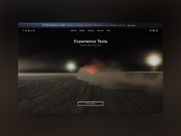
A personal favorite, Tesla does a great job at capturing attention and encouraging further action via either a scroll or a click to schedule a Demo Drive.
Goal 2: Communicate Brand Identity and Establish Trust
Your second goal for the home page is to communicate who you are (also known as your “brand identity”) and establish trust. It’s about taking the quick breadcrumb you dropped in your hero and expanding on it. Your brand identity can be felt in part visually, through colors, logos, etc., and through communicating your mission.
These will tell visitors who you are, but establishing trust is much more about the results you get. After all, you’re in business because you think you’re good at something. To stay in business, you must prove it. We use a combination of your awards, certifications, and your client testimonials throughout your home page. Using elements that show how others view your brand conveys that you are able to provide what you promise. Remember, loyalty and advocacy will come exclusively from the quality of your touch points, your home page usually being one of the first.
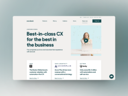
Zendesk literally devotes a whole landing page to building credibility through success stories, testimonials, and data across industries, business challenges, regions, products, and company sizes.
Goal 3: Provide Easy Navigation
I almost made this the second goal. The truth is, navigation is something most businesses rush. It’s an afterthought. To your website visitors, however, it’s key. If they can’t find what they’re looking for quickly on your website, they will find it somewhere else. A well-designed home page still risks losing potential customers without a well-designed menu navigation.
I recommend giving careful thought to your menu. Consider having a search functionality in your menu bar so short-on-time visitors can skip straight to their desired content. Section website content together and use drop-downs. Above all else, make contacting you easy. (You’ll win bonus points with customers if there are multiple places they can contact you throughout your home page too.)
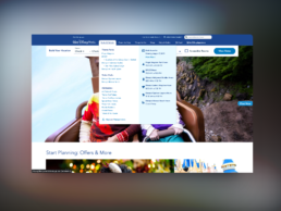
Not always an easy task, see how DisneyWorld organized its large sitemap using drop-downs including subcategories and featured items.
Goal 4: Encourage People to Take Action on Your Home Page
Remember in Goal 1 we talked about giving people a reason to take action? That concept applies to your entire home page. Often, businesses worry about seeming too salesy by having a Call-To-Action button (CTA) on every section of their website. Maybe every section is a bit much. I challenge you to consider what happens if you don’t encourage people enough to take action.
They’re left not knowing what to do or how to do it.
Compelling home pages are maps whose job it is to guide people to take the actions you want them to take. The maps act as accelerated mini funnels, designed to create awareness, immediately move to consideration, and hopefully encourage the user to purchase/convert. Without the proper tools to do this, however, people will get lost and leave your funnel. You must optimize your website home page for conversions by adding strategically placed CTAs, lead capture forms, and links to your top products and services. I like to add an extra dimension to home pages and also incorporate interactive elements, like a well-structured quiz or testimonial video.
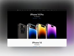
A perfect use of a hero section, Apple beautifully showcases its latest product and presents just two options to its visitors: Buy now, or Learn more.
Goal 5: Enhance User Experience and Responsiveness
We are a mobile-first society. Most people accessing your website are doing so on their phones and tablets. That means we, as designers, are now putting equal, if not more, emphasis on your mobile user experience as on desktop.
Having a fast-loading home page is just the tipping point. Gone are the days when you can get away with a bare-bones mobile site. Your home page design and user experience need to translate to mobile. Your brand identity needs to be able to come through via the mobile version.
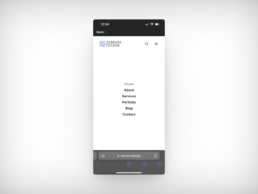
Zamora Design‘s own website incorporates a mobile-only menu designed to be full screen in order to maximize clicking space and minimize distractions.
Goal 6: Incorporate SEO Best Practices for Search Visibility
After designing a great home page, the next step is to make sure people find it. Search Engine Optimization (SEO) is still a very relevant element of any business website. Not only does it help increase visibility, but it’s still more cost-effective than other marketing and advertising tactics. The lifetime benefit of SEO reaches far beyond any social media ad campaign.
You must integrate SEO best practices into your home page, like relevant keywords and proper heading structure. Optimize your images with ALT tags for accessibility and search engine indexing. Not to repeat myself, but don’t forget that the mobile design and page loading speeds we mentioned in Goal 5 also add to your optimization.
Everyone’s Perfect Home Page Looks Different
The beauty of websites is that each one is unique, despite having similar goals. Your home page will likely undergo several adaptations as your brand evolves and adapts to your customers. The goals will remain constant. That’s why it’s important to continuously test your design and optimize it. The best home pages will be able to balance design and functionality to appeal to consumers.
To summarize, when trying to craft the perfect homepage, make sure you check all of these boxes:
- Capture attention with a compelling branding and header
- Quickly introduce your product(s) and service(s) and, ideally, show how they are unique
- Try to anticipate and handle any objections
- Build credibility through testimonials, awards, certifications, etc.
- Make it easy to take action through an appealing Call to Action.
If your website doesn’t hit all five of these boxes then let’s remedy it together. I would love to help your team create a home page that compels and converts. Reach out to start the conversation.

Borja Zamora
A Barcelona native but San Francisco based, Borja explores digital marketing and design through articles, images, and quotes.
Related Posts
July 23, 2024
Beyond Flat Design: The Rise of Neo-Brutalism and Textured Experiences
This year, I’ve seen a rise in Neo-Brutalism style design and textures. Find…
May 31, 2024
Sustainable Practices in Web Design for a Healthier Planet
Today's digital dependence means a higher environmental impact of our online…
December 15, 2023
10 Design Trends in 2024
Ask anyone and they’ll tell you the market is shifting. Most are probably…
October 30, 2023
5 Questions Your Homepage Design Should Answer (B2B and B2C)
There are five questions your homepage must answer, and they stand between a…


