Visual persuasion is the most important component of modern marketing. The reason is simple and scientific: our brains are wired for visual input. Of all the five senses, sight is the most important to human survival by a large margin.
To reach your target audience, you need to effectively leverage visuals and graphics.
Consider these facts:
- 90% of information transmitted to the brain is visual
- 40% of nerve fibers are linked to the retina
- Our eyes register 36,000 messages per hour
The human brain responds best to visual stimuli. A single picture can convey a universe of meaning in just a glance.
So what does this mean for your next marketing campaign? Every effort must be made to master the art of visual communication if you are to truly reach your target audience.
It’s an old cliche, but it remains true today: A picture is worth a thousand words.
Here are the four psychological reasons why visual persuasion is paramount.
01. Visual Images Reach Our Brains Faster
According to the National Center of Biotechnology Information, the average consumer has an attention span of only 8 seconds.
If you rely on text alone to persuade, you will probably lose the consumer’s attention before you have even begun your pitch.
But because the brain processes visual information much faster, you can engage your audience and keep them engaged longer. For example, the human brain:
- Processes a visual scene in 1/10 of a second
- Can see images that last for just 13 milliseconds
- Digests visual information 60,000x faster than text
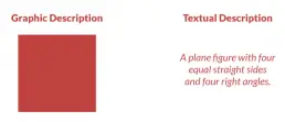
Here’s a quick example.

One of the easiest ways to ensure that learners store information in their long-term memory is to pair concepts with meaningful images.
Source: Uberflip
Which one more quickly conveys the understanding of what a square is?
We see the square instantly. If all we knew about a square was the textual description, it would take a lot of time and mental effort to understand the same concept.
Marketing Lesson: To engage your audience right off the bat, a heavy emphasis on visual data and imagery will be most effective.
02. People Remember Visual Stimuli Longer
Visual stimuli not only get your attention faster, but they leave a deeper and more indelible mark in your long-term memory. According to Dr. Lynell Burmark, an educational psychologist who studies visual literacy:
Words are processed by our short-term memory, where we can only retain about seven bits of information…Images, on the other hand, go directly into long-term memory where they are indelibly etched.
According to one study:
- Only 10-20% of information from an oral presentation was remembered after three days.
- Only 10% of data was remembered from reading.
- But 65% of information gleaned from visual data was remembered at the end of the three-day period.
As an old Chinese proverb says:
“What I hear, I forget; What I see, I remember.”
Marketing lesson: We want our product to be noticed, but we also want that product to be remembered. Visual imagery is the best way to be both noticed and remembered.
03. Visual Stimuli Evokes More Emotion Than Verbal
Visual stimuli remain in our long-term memories because they trigger emotional responses. Emotions are stored in the brain’s medial temporal lobe, which is also where visual memory is stored. Therefore, emotion and visual memory are inseparably linked.
In short, emotions are the most potent human motivators, and visual stimuli are more effective than words when it comes to evoking powerful emotions.
For example, which would be a more effective way to transmit the idea that we sell good baby food?
Gerber: Healthy Food for Your Baby
Or…

This iconic picture is instantly recognizable, memorable, and it subliminally conveys the emotion of love. The picture says: “I love my baby enough to give her only the best,” far better than any words ever could.
When it comes time to grab a bottle of baby food, who could resist grabbing the bottle with that picture?
Let’s try another example.
We all know that for years the cigarette industry used compelling imagery to hook people on smoking with Joe Camel, or this guy, the Marlboro Man:

Images like these associated smoking with personality traits like toughness and manliness. These traits will remain forever embedded in our consciousnesses. For many people, these images overpowered all logical appeals to refrain from smoking for health reasons.
To combat the health crisis caused by smoking, the government started requiring cigarette companies to post the following warning on cigarette labels.
“Surgeon General’s Warning: Cigarette smoking is dangerous to your health.”
Over time, the labels used ever more graphic language, such as:
“Surgeon’s General Warning: Smoking Causes Lung Cancer, Heart Disease, Emphysema, and may complicate pregnancy.”
But none of these verbal appeals had much effect on the sales of cigarettes until effective imagery was employed in the anti-smoking campaigns.
Such images not only have immediate shock value, but the emotions they evoke remain etched in the long-term memory as well.
Were these images effective for the campaign?
Since the ban on the Marlboro Man-style advertising promoting smoking, and since the introduction of these kinds of anti-smoking ads that visually depict the dangers of smoking, the rate of cigarette use had dropped from a high of 45% in 1954 to 16% in 2018.
Marketing lesson: The first rule of marketing is to sell with emotion. Effective imagery is the best way to stir emotion and will create the most powerful, long-lasting associations with your product.
04. Visuals Bring Clarity and Aid in Comprehension
If the first rule of marketing is to sell with emotion, the second rule is to help consumers justify their emotions with logic.
A campaign or pitch that is unclear or confusing will not convert.
Effective visuals bring clarity to your marketing and help your audience better understand your message.
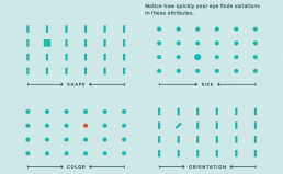
The following chart shows how this works from the perspective of human psychology.

Our brains are pre-wired to automatically interpret relationships between objects, allowing for almost instant comprehension with minimal effort.
Source: Shiftelearning.com
Notice how quickly your eye finds variations in these attributes.
The brain is instantly attracted to visual cues like size, shape, and color. Textual information that is presented in combination with visual cues will be much more interesting, more straightforward, and more easily understood.
As Stanford University’s Robert E. Horn explained:
When words and visual elements are closely intertwined, we create something new and we augment our communal intelligence…visual language has the potential for increasing ‘human bandwidth’ — the capacity to take in, comprehend, and more efficiently synthesize large amounts of new information.
In other words, effective images in conjunction with text makes your message easier to understand.
So, to bring greater clarity and comprehension to your marketing, try the following strategies:
- Incorporate visual cues like lines and arrows to direct the attention of visitors on your website so that users stay and explore longer with more clarity and confidence
- Tell your stories using visual aids like photographs, gifs, or short videos.
- Use infographics to engage your readers. Visual aids clarify your message and dispel confusion better than long-form content alone.
Marketing lesson: Visual aids like infographics bring greater attention to your marketing effort and facilitate clarity and comprehension, which instills consumer trust.
The Data Is Beyond Doubt: Visual Persuasion Works!
Do you still doubt the value of using visual cues to complement the text in your marketing?
Consider these statistics about the effectiveness of infographics and other visuals in modern marketing.
- Infographics are 30X more likely to be read in their entirety than blog posts or news articles (Digital Information World)
- Web articles that contain images receive 94% more views than articles that don’t (Jeff Bullas)
- Infographics and colorful visuals can increase sales by 80% (Xerox)
- Facebook posts with images receive 2.3X as much engagement as a post without an image (Buzzsumo)
- Tweets that include images are 150% more likely to be retweeted (Jeff Bullas)
- 56% of marketers use visuals in all of their marketing content (Social Media Today)
- 65% of brands use infographics for marketing purposes (Xerox)
- Presentations with visual aids are 43% more persuasive (Sproutworth)
Visual Persuasion Is Effective, but Only if Done Right
Have you ever listened to a bad karaoke singer or a bad stand-up comedy routine?
Music and comedy are wonderful, but if they’re done badly, they can be insufferable. The same is true with visual design.
There is an intricate and delicate science and art to visual design. Of course, the design must be attractive, but it must also be relevant and persuasive.
There are many factors to consider in order to strike the right balance:
- What pictures or illustrations to use to highlight the point your text is making
- Which colors, backgrounds, and fonts to use to evoke precisely the kind of emotion appropriate for what you are selling
- How to set up a visual hierarchy and page layout that is both clearly organized and attractive, yet not too distracting or loud
Done correctly, visual design is an invaluable aid to your marketing. Done incorrectly, and it can be worse than no visual marketing at all.
Don’t leave the visual design of your website, sales page, or presentation to chance. Contact me to learn more.
Borja Zamora
A Barcelona native but San Francisco based, Borja explores digital marketing and design through articles, images, and quotes.
Related Posts
November 18, 2024
Crafting the Future: OpenAI’s Strategic Narrative
Explore OpenAI's strategic narrative and discover how storytelling shapes its…
November 18, 2024
Unpacking Shopify’s Strategic Narrative: Rewriting the Rules of eCommerce
Explore how Shopify transformed from a snowboard shop to a global commerce…
November 12, 2024
Canva’s Strategic Narrative: How Design Democratization Created a $40 Billion Empire
Discover how Canva's strategic narrative empowers creativity through…
November 12, 2024
Nintendo’s Strategic Narrative: A Masterclass in Storytelling
In the ever-evolving landscape of the gaming industry, Nintendo stands as a…


