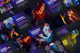
Cutting-edge presentation designs
Coming to pitch decks in 2025.
Table of Contents.
As we step into 2025, presentation design trends are evolving at an unprecedented pace. From interactive elements to biophilic designs, this article explores ten innovative trends that are set to transform how tech professionals, entrepreneurs, marketers, and designers convey their ideas. Embrace these trends to create engaging, memorable presentations that captivate your audience and elevate your brand.
Introduction
In a world where attention spans are shrinking and competition for engagement is fierce, the art of presentation design is more critical than ever. As we look ahead to 2025, it’s essential to stay ahead of the curve and adopt innovative strategies that resonate with audiences. This year promises exciting trends that blend technology, creativity, and psychology, making presentations not just informative but also immersive experiences. Whether you’re pitching a groundbreaking idea or sharing insights at a conference, understanding these trends will empower you to craft compelling narratives that leave a lasting impact.
The Importance of Staying Updated
Staying updated with presentation design trends is not just about aesthetics; it’s about ensuring your message is communicated effectively. Modern audiences are accustomed to high-quality visuals and engaging content due to their experiences with digital media. Therefore, leveraging these trends can significantly enhance your ability to connect with your audience.
1. Dark Backgrounds with Neon Accents
One of the standout trends for 2025 is the use of dark backgrounds paired with bright neon accents. This combination creates a striking contrast that draws attention and enhances readability. As more presentations shift towards digital formats, this aesthetic not only looks modern but also helps highlight key information effectively.
Why Dark Backgrounds?
Dark backgrounds can reduce eye strain and make it easier for viewers to focus on the content presented. The neon accents serve as visual cues that guide the audience’s attention to critical points or data. For example, using a deep navy background with vibrant pink or green text can create a visually arresting slide that captivates your audience from the start.
Examples in Action
Consider tech companies like Apple or Google, which often utilize dark themes in their presentations during product launches. This approach not only aligns with their branding but also enhances the overall viewing experience when combined with high-quality visuals.
2. Nature-Inspired Designs
Nature is making its way into presentation design as biophilic elements gain traction. Incorporating organic shapes, earthy color palettes, and nature-themed visuals can evoke feelings of calm and connection. This trend not only beautifies presentations but also aligns with the growing emphasis on sustainability.
The Psychology Behind Nature-Inspired Design
Research suggests that exposure to nature can reduce stress and increase feelings of well-being. By integrating nature-inspired designs into presentations, you can create an environment that fosters engagement and positivity among your audience.
Practical Implementation
Using images of natural landscapes or incorporating green tones can create a refreshing atmosphere that resonates with audiences seeking authenticity. For instance, a presentation on environmental sustainability could feature backgrounds of forests or oceans alongside statistics about climate change—creating a visual narrative that reinforces the message.
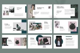
This Nature Creative Presentation by spacestudios features a clean, nature-inspired design that helps set a soothing tone and relax your narrative.
3. Minimalism Reigns Supreme
The minimalist design philosophy continues to dominate in 2025. Clean lines, ample white space, and a focus on essential content help eliminate distractions and keep audiences engaged.
The Benefits of Minimalism
Minimalism encourages clarity in communication—less truly is more. By stripping away unnecessary elements, you allow your core message to take center stage, making it easier for your audience to absorb the information presented.
How to Achieve Minimalism
To achieve a minimalist design, focus on:
- Content: Limit text on slides; aim for key points rather than paragraphs.
- Visuals: Use high-quality images that complement your message without overwhelming it.
- Layout: Create a balanced layout with plenty of white space around text and images.
Real-World Example
Companies like Airbnb have successfully employed minimalism in their presentations by using large images and concise text. This approach not only showcases their brand identity but also makes their messages clear and impactful.
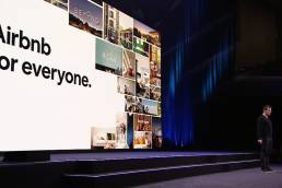
Airbnb has mastered the art of minimalist design in recent years, and this trend shows no signs of slowing down. In 2025, we can expect to see an even bigger shift towards a more image-centric approach, with fewer bullet points and more visual storytelling.
4. Muted Pastels Take Center Stage
While bold colors have their place, muted pastels are emerging as a preferred choice for modern presentations. These soft hues create an inviting atmosphere and allow content to shine without overwhelming viewers.
The Appeal of Muted Colors
Muted pastels convey professionalism while adding warmth—perfect for conveying messages related to wellness or community-focused initiatives. They evoke feelings of calmness and approachability, making them ideal for presentations aimed at fostering connection.
Implementing Muted Pastels
When using muted pastels:
- Combine them with darker shades for contrast.
- Use them as background colors while keeping text dark for readability.
- Pair different pastel tones harmoniously to create a cohesive look across slides.
Case Study: Successful Use of Pastels
Brands like Slack have utilized muted pastel colors in their marketing materials effectively. Their presentations feel friendly yet professional—an excellent balance for engaging diverse audiences.
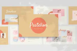
This Pastel Style Presentation Template by naulicrea features a minimalist design and soft, calming pastel palette to create a visually appealing and engaging experience for its audience, allowing them to focus on the message.
5. Evolving Data Visualization Techniques
Data storytelling is evolving beyond traditional charts and graphs. In 2025, expect to see more creative data visualizations that incorporate animations and interactive elements.
Engaging Your Audience with Data
These techniques not only make complex information digestible but also engage audiences in a more meaningful way. For example, using animated infographics can help illustrate trends over time or showcase relationships between data points in an engaging manner.
Tools for Enhanced Data Visualization
There are numerous tools available today that facilitate creative data visualization:
- Tableau: Great for interactive dashboards.
- Infogram: Ideal for creating infographics.
- Google Charts: Useful for embedding live charts into presentations.
Example: Dynamic Data Presentation
Imagine presenting quarterly sales data through an animated chart that visually represents growth over time rather than static numbers on a slide—this makes the data more relatable and easier to understand.
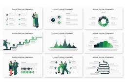
While not the most practical for everyday use, this Annual Startup Infographic Powerpoint Template by Kitpro demonstrates the power of visual storytelling. By employing clever charts, icons, and illustrations, it presents complex data in a clear and engaging manner. This template proves that a well-crafted visual can often convey information more effectively than a list of bullet points.
6. The Comeback of Serif Fonts
Serif fonts are experiencing a resurgence in presentation design. Their classic elegance adds a touch of sophistication while improving readability on screens.
Why Choose Serif Fonts?
Using serif fonts strategically can enhance your brand’s identity and convey professionalism. They evoke feelings of tradition and reliability—qualities often sought after in business communications.
Best Practices for Using Serif Fonts
When incorporating serif fonts:
- Ensure they are legible at various sizes.
- Pair them with sans-serif fonts for contrast (e.g., use serif for headings and sans-serif for body text).
- Avoid overly decorative serif fonts; opt for clean styles instead.
Notable Examples
Brands like The New York Times effectively use serif fonts in their branding materials—conveying authority while maintaining readability across various platforms.

After years of being overshadowed by minimalist sans-serif fonts, serif fonts are making a resurgence. We’re starting to see brands experiment with combining both serif and sans-serif fonts within the same sentence or logo. Here at Zamora Design, we’re embracing this trend and incorporating it into our work.
7. Image-Centric Designs
Visual storytelling is taking precedence over text-heavy slides. Presentations are becoming increasingly image-centric, relying on powerful visuals to convey messages succinctly.
The Power of Visual Storytelling
This trend encourages presenters to think visually and use images that resonate emotionally with their audience. Instead of lengthy bullet points, consider using impactful images or illustrations that tell your story at a glance.
Tips for Effective Image Use
To maximize the impact of images:
- Choose high-resolution images relevant to your topic.
- Use visuals strategically—each image should serve a purpose.
- Consider incorporating infographics or charts as visual aids instead of text-heavy slides.
Example: Effective Image Use in Presentations
TED Talks often exemplify effective image-centric designs by using striking visuals alongside minimal text—allowing speakers to connect deeply with their audience through storytelling rather than overwhelming them with information.

As Apple has demonstrated, images are set to become the dominant visual element in 2025. With the rise of generative AI, creating custom visuals to complement any message is becoming easier than ever. Even without formal design training, anyone can generate the perfect image to enhance their presentation.
8. Hand-Drawn Elements
To add a personal touch, many designers are incorporating hand-drawn elements into their presentations. These whimsical illustrations can break the ice and create a more relatable atmosphere, making content feel approachable and engaging.
Benefits of Hand-Drawn Design Elements
Hand-drawn elements humanize your presentation by adding character and warmth—qualities that resonate well in informal settings or creative industries.
Incorporating Hand-Drawn Elements Effectively
When using hand-drawn elements:
- Ensure they align with your overall message.
- Use them sparingly; too many can distract from key points.
- Consider hiring an illustrator if you lack drawing skills—custom illustrations can significantly enhance your presentation’s appeal.
Case Study: Successful Use of Hand-Drawn Elements
Companies like Mailchimp have successfully integrated hand-drawn illustrations into their branding materials—creating an inviting atmosphere while communicating complex ideas simply.

This Business Social Media Template by TemeGUM skillfully blends minimalism, creativity, and style. The effective use of hand-drawn elements adds a touch of customization and sophistication, making it a standout choice for businesses looking to elevate their social media presence.
9. Neumorphic Design Interfaces
Neumorphism—a design trend characterized by soft shadows and subtle gradients—is making waves in presentation interfaces. This style creates a tactile experience that feels modern and sophisticated, enhancing user interaction during presentations.
Understanding Neumorphism
Neumorphism combines flat design principles with skeuomorphism (design elements resembling real-world objects). This creates depth without overwhelming users—a perfect balance for digital presentations where user experience matters greatly.
Implementing Neumorphic Design
To effectively use neumorphic design:
- Focus on subtle shadows rather than harsh contrasts.
- Maintain consistency across slides—use similar shapes and styles throughout.
- Ensure accessibility by considering color contrasts carefully; not all users perceive subtle differences equally.
Example: Neumorphic Design in Action
Some apps have begun adopting neumorphic interfaces successfully; think about how these principles could translate into presentation software—creating an intuitive experience during live demonstrations or webinars!

Neumorphism, a design trend that adds depth and dimension to interfaces, is poised to become a popular aesthetic choice for software, websites, and mobile apps in 2025. This technique, characterized by subtle shadows and highlights, creates a visually appealing and modern look.
Source: Toptal
10. SEO Optimization for Presentations
As digital content becomes increasingly searchable, applying SEO techniques to presentation designs is gaining traction. This includes optimizing titles, using relevant keywords throughout slides, and ensuring accessibility—making your presentations not just visually appealing but also easy to find online.
Why SEO Matters
With so much content available online today—including recorded webinars or shared slide decks—optimizing your work ensures it reaches its intended audience effectively!
Key SEO Techniques
To optimize your presentations:
- Use descriptive titles containing relevant keywords.
- Include alt text descriptions for images used within slides.
- Share recordings via platforms like YouTube or SlideShare while optimizing descriptions there too!
Real-Life Application
Consider how organizations like HubSpot leverage SEO principles when sharing educational content—they ensure maximum visibility while providing value through informative resources!
Conclusion
As we embrace these innovative presentation design trends in 2025, it’s clear that the future of presenting is all about engagement and connection. By integrating technology with creativity and thoughtful design principles, you can create presentations that not only inform but also inspire action. Whether you’re sharing insights at a conference or pitching your startup idea to investors, staying ahead of these trends will ensure your message resonates long after the presentation ends.
Related Posts
December 5, 2024
How to Become a Freelance Powerpoint Designer (Part 2)
Discover essential strategies for becoming a successful freelance PowerPoint…
December 5, 2024
How to Become a Freelance Powerpoint Designer (Part 1)
Unlock the secrets to becoming a successful freelance PowerPoint designer.…
September 18, 2024
Crafting Compelling Strategic Narratives: A Deeper Dive
Strategic narratives, the compelling tales that businesses weave to convey…
September 17, 2024
What’s a Strategic Narrative and Why Do I Need One?
Discover the power of storytelling in business! Learn how to create a strategic…
