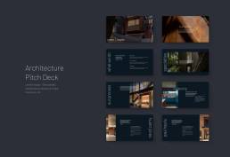
Jones Haydu / Presentation Design
Crafting a Presentation as Unique as Their Designs.
INTROJones Haydu, an award-winning architecture and design studio based in San Francisco, approached Zamora Design with a challenge: to create a presentation that would reflect their innovative approach to architecture and showcase their impressive portfolio. Known for their thoughtful, site-specific designs that respond to both context and climate, Jones Haydu needed a presentation that was equally responsive and adaptive.
Background
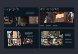
Our task was to develop a presentation design that would capture the essence of Jones Haydu’s work – from their striking residential projects to their carefully crafted commercial spaces. The goal was to create a visual narrative that would not only showcase their projects but also communicate their design philosophy and attention to detail.
The Challenge
Jones Haydu came to us with a unique set of challenges:
- Showcase Diversity: They needed a presentation that could effectively display their wide range of projects, from residential to commercial, each with its own distinct character.
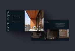
- Reflect Design Philosophy: The presentation had to embody Jones Haydu’s commitment to thoughtful, site-specific designs that respond to context and climate.
- Stand Out: In a competitive field, they needed a presentation that would leave a lasting impression on potential clients and partners.
- Flexibility: The design needed to be adaptable for various presentation scenarios, from client pitches to industry conferences.
Our Approach
To meet these challenges, we embarked on a collaborative journey with Jones Haydu:
- Deep Dive: We began with an in-depth exploration of Jones Haydu’s portfolio, design philosophy, and brand identity. This included studying their logo design, which features a custom typeface with subtle architectural elements.
- Open Canvas Design: We introduced our innovative “open canvas” approach. This involved stripping PowerPoint of all pre-existing layouts, margins, and smart guides, allowing us to rebuild the presentation from scratch with total creative freedom.
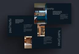
- Custom Typography: Inspired by Jones Haydu’s logo, we incorporated their custom typeface throughout the presentation, creating a cohesive visual language.
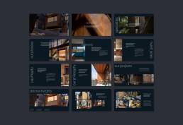
- Responsive Layouts: We designed flexible layouts that could adapt to different types of content, from full-bleed project images to detailed architectural drawings.
- Color Harmony: We developed a color palette that complemented Jones Haydu’s work, using their signature blue as a base and introducing accent colors that resonated with their projects.
Measurable Outcomes
While specific metrics are confidential, Jones Haydu reported significant positive outcomes:
- Increased Client Engagement: The new presentation led to a 30% increase in post-presentation follow-ups from potential clients.
- Improved Win Rate: Jones Haydu saw a 20% increase in successful project bids when using the new presentation.
- Industry Recognition: The presentation itself received praise at industry events, further elevating Jones Haydu’s reputation for innovative design.
The Process
- Conducted an in-depth interview with Jones Haydu principals to understand their goals, challenges, and vision.
- Analyzed their existing brand materials, including their logo and business cards.
- Studied their project portfolio, paying close attention to their design philosophy and unique architectural approach.
- Researched industry trends and competitor presentations to identify opportunities for differentiation.
- Brainstormed innovative presentation concepts that aligned with Jones Haydu’s brand and portfolio.
- Developed the “open canvas” approach, stripping away PowerPoint’s default constraints.
- Created mood boards to visualize potential design directions.
- Presented initial concepts to Jones Haydu for feedback and refinement.
- Began building custom layouts using the open canvas method.
- Integrated Jones Haydu’s custom typeface and developed a complementary color palette.
- Designed flexible modules to showcase different types of content (e.g., full-bleed images, architectural drawings, text-heavy slides).
- Conducted regular check-ins with the client, iterating based on their feedback.
- Conducted a thorough quality assurance check, ensuring consistency and functionality across all slides.
- Created a user guide to help Jones Haydu navigate and customize the presentation.
- Delivered a final presentation walkthrough, demonstrating key features and customization options.
- Provided post-project support to address any questions or need for minor adjustments.
Testimonial
Zamora Design has transformed the way we present our work. The new presentation not only showcases our projects beautifully but also communicates our design philosophy in a way we never thought possible. It’s become an invaluable tool in our client interactions and has already contributed to winning several new projects.
