sfBIG / Branding
A Fresh Look for a Trusted Voice.
INTROWhen sfBIG, the San Francisco Bay Area Interactive Group, approached us to reimagine their brand, they had a clear goal: to modernize their identity while staying true to their roots as a connector and innovator in the digital community. With a mission to unite brands, agencies, and tech leaders, sfBIG needed a brand that was bold, engaging, and reflective of the ever-evolving industry they represent. This project was about more than just design—it was about telling sfBIG’s story in a way that inspires trust, fosters collaboration, and energizes their community for years to come. Here's how we did it.
Background
San Francisco Bay Area Interactive Group (sfBIG) is a non-profit professional association dedicated to connecting brands, agencies, media, and technology in the Bay Area. Their mission is to educate, inspire, and unite the local digital community while championing innovation and creating opportunities.
The Challenge
sfBIG needed a refreshed brand identity that reflected their dynamic role as a connector and innovator in the industry. The organization wanted a modern, cohesive brand that resonated with their tech-savvy, creative audience and conveyed trust, professionalism, and community.
Key goals included:
- Modernizing the brand identity to better reflect the evolving industry.
- Reimagining the visual identity for both print and digital platforms.
- Developing clear brand guidelines to ensure consistency across all touchpoints.
- Creating excitement and engagement through the rebrand.
Our Approach
To deliver a successful rebrand, I started with a deep dive into sfBIG’s mission, vision, and audience. Key steps included:
Discovery Phase:
- Conducted stakeholder interviews to identify pain points and goals.
- Analyzed the competitive landscape of similar organizations to find opportunities for differentiation.
Strategic Branding:
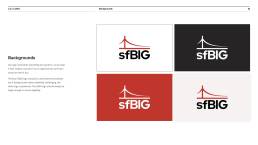
- Developed a refined logo that merges creativity and professionalism.
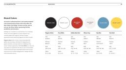
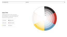
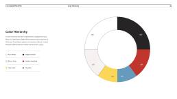
- Selected a bold, modern color palette that evokes energy and innovation.
- Designed typography and iconography that are clean, approachable, and versatile.
Brand Guidelines:
- Created a comprehensive brand book outlining logo usage, colors, fonts, tone of voice, and visual standards.
- Ensured the guidelines supported ease of use for sfBIG’s internal and external partners.
The Results
The rebrand successfully positioned sfBIG as a forward-thinking, vibrant organization while staying true to its roots. The refreshed identity:
- Reinforced sfBIG’s commitment to innovation and community.
- Improved brand consistency across platforms, enhancing professionalism and trust.
- Energized the membership base, sparking increased engagement on social media and at events.
Project Highlights
The sfBIG rebranding project delivered a sleek and modern logo paired with a bold color scheme that reflects the organization’s innovative spirit. Comprehensive brand guidelines were developed to ensure long-term consistency across all platforms, covering logo usage, typography, color palettes, and tone of voice.
Engaging visual assets, including redesigned presentation templates, social media graphics, and website visuals, were created to bring the brand to life across digital and print mediums. These cohesive elements came together to elevate sfBIG’s professional image and energize its presence within the Bay Area’s digital community.
