It’s possible to get noticed and remain true to your brand in the noisy world of digital marketing, but standing out of the crowd requires boldness and creativity. Sure, that Helvetica logo with default colors will be quick and cheap, but is that the symbolism you want for your brand?
In creating effective graphic designs, you have two primary goals. You want to clearly illustrate to the public who you are, but at the same time, you want to differentiate yourself from your competition. It can be a difficult balance.
In the search for clarity, we often rely on cliches. For example, Chinese restaurants almost always want “chopstick” lettering on their sign to impart the image of Chinese food. Real estate offices seem hooked on incorporating rooftop images into their logos.
These graphics certainly help us understand each industry, but they also convey the message: “We’re just like all the rest. Nothing special here.”
Dan Mayer, writing for Smashing Magazine, illustrated the limitations of cliches in design with the following example. Here’s one way to create a design to discourage teenage drunk driving:

It’s direct and leaves no doubt as to what it means. But we’ve all seen the ubiquitous hexagonal STOP sign 10 zillion times. What impact does this really have?
After challenging himself creatively, the designer created a different and more original design with a crystal-clear message. Avoiding the cliche helps attract and engage the viewer’s attention.
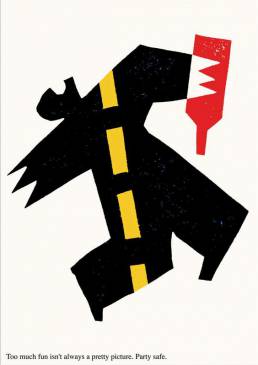
Which is more effective? You decide.
As Mayer summarized:
“Cliches are the empty calories of the design world. Like junk food, they are available everywhere and easy to consume, but pass through us without leaving nutrition behind…Cliches fail to create a message that will live in a viewer’s memory nor foster long-term recognition and loyalty.”
Cliches are the easy way out for graphic designers. They can be useful, but ultimately truly effective creative graphic design must rise above. But how?
Try these 6 tips to avoid cliches in your creative design.
01. Set Clear Goals Before Starting Your Design Project
Many people believe graphic designers are geniuses who get struck by lightning bolts of creative insight.
In reality, however, this approach often results in cliche design that does not resonate with the intended audience, like the stop sign example above.
Before starting a project:
- Consider your ideal customer. What kinds of symbols, colors, shapes, etc are most likely to strike a chord with your intended audience?
- Know your WHY. What message are you trying to tell your market?
When your design focuses on specific business goals, you are more likely to bypass cliches.
02. Start with a Sketchbook, Not a Computer
Of course, modern design is done on a computer. But the computer was made for man, not man for the computer.
When we start the design process using the computer, the computer’s toolset can limit a designer’s thinking and funnel creativity into directions that are convenient for the technology – pre-programmed design cliches.
Create the concept first in your mind, and then draw that concept by hand. Engage the computer later in the process to create what was first in your mind.
Master the computer. Don’t let it master you.
03. Recognize the Common Cliches and Avoid Them
Cliches are so deeply embedded in our minds that we often revert to cliches without even being consciously aware of it. So one essential step in avoiding cliches is recognizing them.
There are more design cliches than anyone could possibly count, but here is a shortlist of some of the most common:
- Helvetica Font Logos: Sure, spelling out the company name in a cool font worked for Microsoft. But unless you have that kind of marketing budget, it will be difficult to establish serious brand recognition for a simple name logo.
Source: GraphicPear
- Industry-Specific Logos: The scales of justice in law. Wheels for automobiles. A web for software companies. Roofs for construction or real estate companies.
Source: 99designs
- The Arc: The arc represents security, rising above, flexibility, and/or forward motion, etc. But today it is overused.
Source: Designshack
- Jigsaw Puzzle Pieces: The meaning is we’ll help you piece together a solution. By thinking outside the box. Two all-too-common cliches.

Source: Pinterest
- The Globe: Brands that like to emphasize their global reach with this logo. It’s been done in so many ways that it’s probably impossible to create a unique variation.
Source: Pinterest
If you are using one of these or any other cliche, you should try another approach.
04. Avoid Trends
Following trends in design is like buying hot stock. How many times have you heard someone say something like this: “If I’d bought $100 in Amazon stock in 2000. I’d be a billionaire now.”
But of course, very few people bought Amazon stock in 2000, because they had never heard of it. Once they had heard of it, it was too late. All the big gains had already been made.
It’s the same with trends in graphic design.
Of course, every designer would like to be the one to start a trend, but unless you are a very early adopter, by the time you’ve noticed the trend it’s probably already a cliche, or about to become one.
05. Insist on Originality; Have the Courage to Stand Out
It’s very challenging to avoid cliches in graphic design. They are cliches for a reason — they work. And they are everywhere. Their very familiarity makes them almost irresistible.
But as Mayer says, “in the haste to fit in, the need to stand out has been forgotten. It is our responsibility as designers to make the case that design can serve both ends at once: it can speak plainly while still leaving a mark on its audience.”
Avoiding the trap of cliches requires conscious effort.
06. Use Cliches to Your Advantage
Creativity is a process. When you begin a design project, use your sketchbook to capture all the ideas that come to mind, even the cliches.
Then, take a critical but fair look at the ideas before you.
In some cases, cliches can evolve into original ideas.
For example, look at the design for the cover of this book about the years between WWI and WWII called “Between the Wars.”
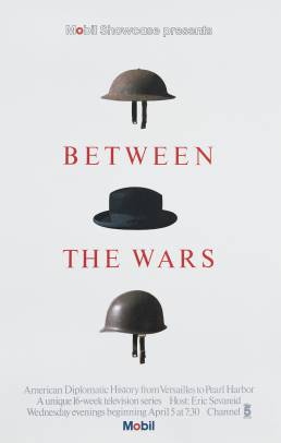
The helmet as a symbol of war is a cliche. The period between the wars (the two helmets) was marked in large part by ineffective diplomacy. The symbol of the top hat is a cliche for that as well.
And yet, by an arduous process of trial and error, the designer created something original, evocative, and meaningful, not by avoiding the cliches but by assembling them into something unique.
The point is this: originality and creativity are learnable skills that can be achieved incrementally through practice, clear thought, and objectivity about your own work. And by doing so, sometimes you can use familiar – even cliched – symbols to express original ideas.
Are your design ideas stuck in a rut?
I can help. I understand how the process of original design can create something that is both meaningful and attractive. And I can put that experience to work for you.
Contact me today to learn more. Or simply to chat about branding.
Related Posts

5 Questions Your Homepage Design Should Answer (B2B and B2C)
There are five questions your homepage must answer, and they stand between a…

Science Says: Visual Persuasion Is Paramount
Visual persuasion is the most important component of modern marketing. The…

10 Tips for a Powerful Presentation
While presenting, never forget to whom you are speaking. Know how to master…